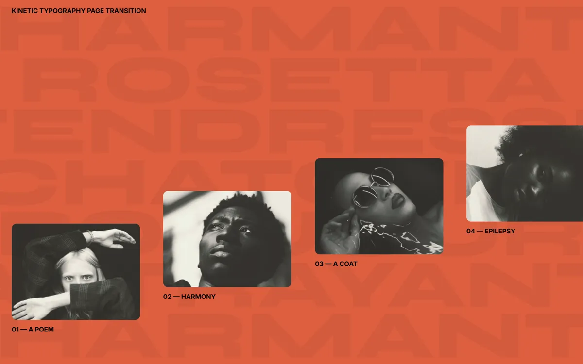
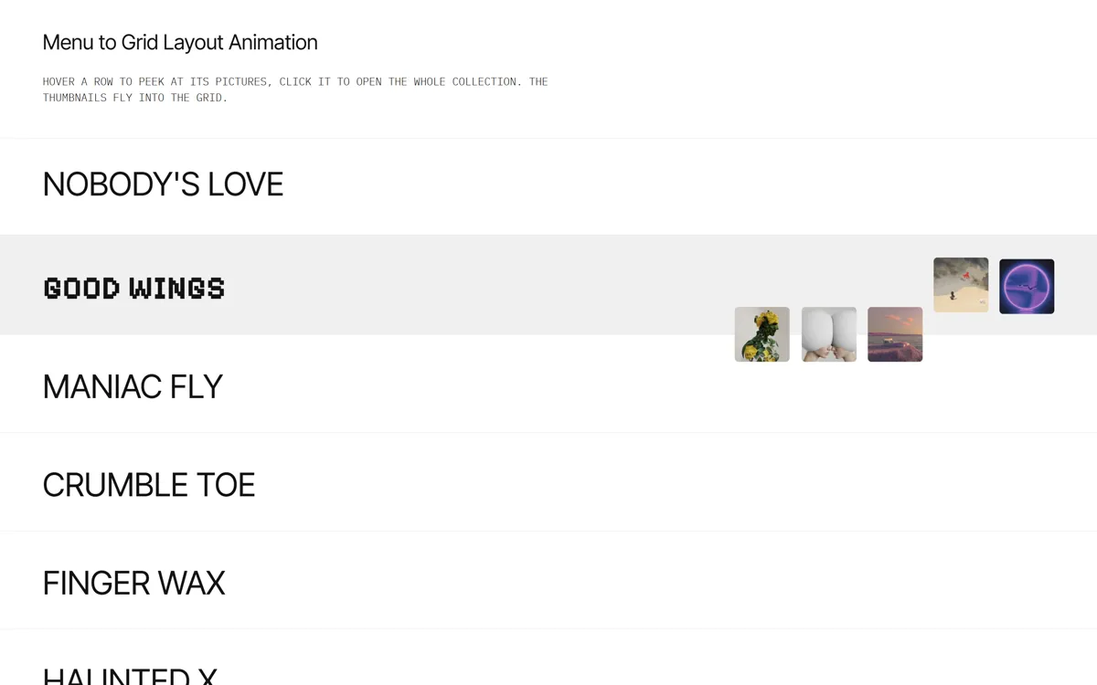
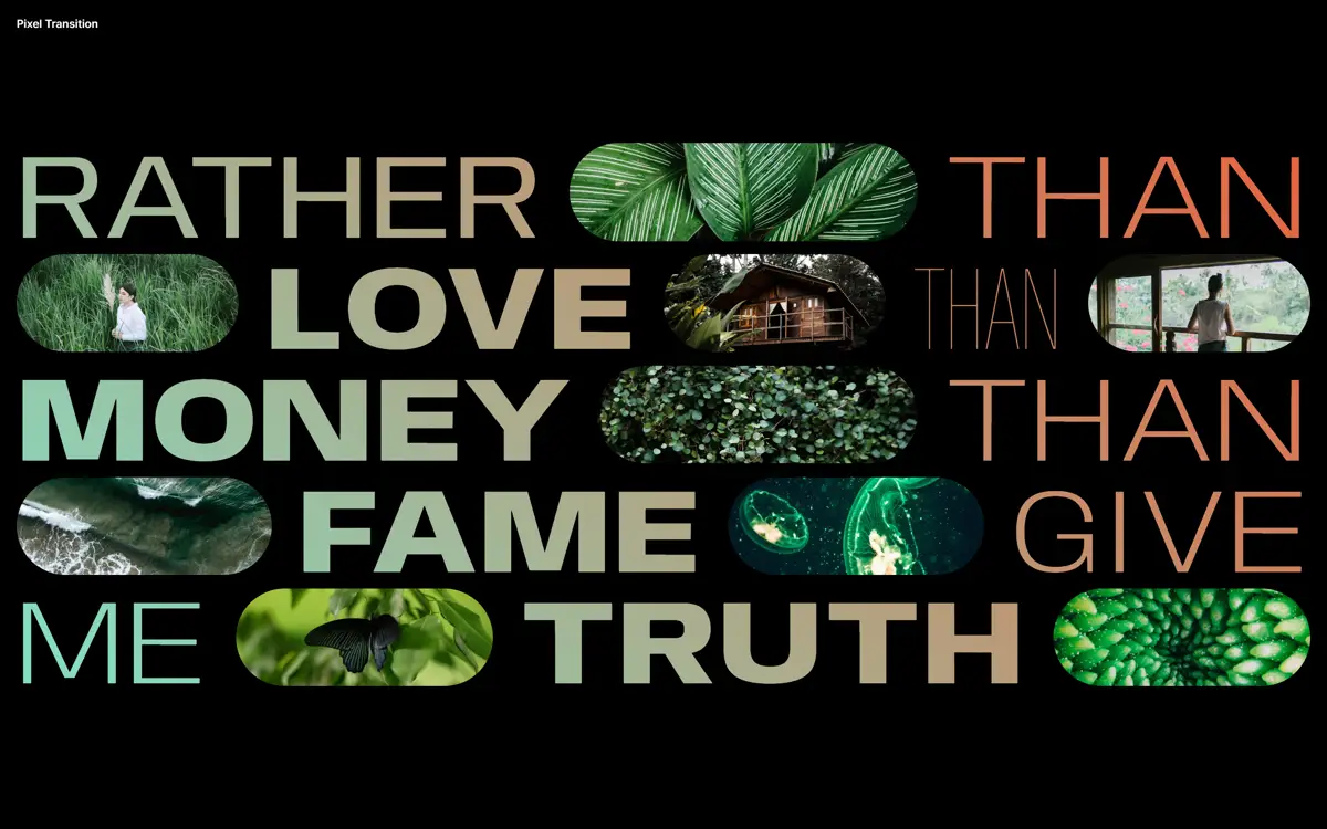
Переход страницы, в который врывается гигантская типографика
Клик по карточке: фоновые слова разворачиваются на 90°, летят вперёд и открывают статью. Назад всё собирается обратно.
Промпт
Добавь на мой сайт эффект «Переход страницы, в который врывается гигантская типографика» (по мотивам Codrops KineticTypePageTransition, MIT). Ниже готовая страница на HTML, CSS и GSAP 3.13.0 с jsdelivr: четыре карточки, по клику на карточку идёт переход и открывается статья, кнопка со стрелкой возвращает назад. Сначала перенеси страницу как есть и проверь клик и возврат, и только потом подгоняй под мой дизайн.

Как устроен код. Блок `.type` (с `data-type-transition`) занимает квадрат `100vmax` на `100vmax` по центру экрана, внутри него строки `.type__line` с повторяющимися словами огромного размера; в покое их прозрачность `--type-line-opacity: 0.05`. Функция `typeIn` собирает таймлайн: весь блок за 1,4 секунды поворачивается на `-90°` и увеличивается до `scale: 2.7`, а строки получают `stagger: 0.04` и двигаются по `keyframes` (сначала вправо на 20%, потом далеко влево на −200%), их прозрачность поднимается до 1 и падает до 0. `typeOut` возвращает всё обратно (`ease: 'back'`). Функция `openItem` строит общий таймлайн с метками: `start` (карточки гаснут, `y: ±25%`, рамка гаснет), `typeTransition` (запуск `typeIn`) и `articleOpening` (на 75% длины перехода): тогда у нужной статьи ставится класс `article--current`, а её заголовок, номер, вступление и текст выезжают с `stagger`. Картинка раскрывается противоположными сдвигами обёртки (`y: 100%` к 0) и самой картинки (`y: -100%` к 0). `closeItem` делает всё в обратном порядке. Флаг `isAnimating` не даёт запустить второй переход, пока идёт первый.

Что менять: записи в массиве `ENTRIES` (заголовок, вступление, текст), картинки (маленькая `img/N.jpg` для карточки и большая `img/large/N.jpg` для статьи), слова в `WORDS`, цвета (`--color-bg` и `--color-type`), шрифт (для эффекта нужен широкий жирный шрифт), время переходов и масштаб `scale: 2.7`. Расположение карточек лесенкой задают `--base` и `--interval`; код рассчитан на широкий экран, для телефона придётся делать отдельную раскладку и показывать статью под карточками.

Если проект на React: рассматривай переход как переключение состояния «список или статья», а таймлайны создавай в `useEffect` или `useGSAP` и при размонтировании убивай через `tl.kill()`. Не убирай `will-change` на `.type` и строках и `overflow: hidden` у `main`, иначе анимация будет дёргаться и появится прокрутка. Если у посетителя включено `prefers-reduced-motion`, замени переход простым появлением статьи.
Покажи, где на моём сайте такой переход лучше всего подойдёт.
Код скопируется вместе с промптом
На оранжевом фоне стоят четыре карточки лесенкой, а за ними едва заметно проступают строки огромных слов. Клик по карточке запускает переход: карточки разъезжаются вверх и вниз и гаснут, весь блок слов поворачивается на 90° и увеличивается, строки по очереди уезжают за край, на секунду становясь почти чёрными и закрывая весь экран, а затем на их месте проявляется статья с огромным заголовком и картинкой, которая «выезжает» из своей маски. Кнопка «назад» разворачивает всё в обратном порядке.
Сделано на одном GSAP: два таймлайна для фоновой типографики (in и out), общий таймлайн для карточек и статьи со смещёнными метками (статья появляется, когда буквы ещё не ушли). Подходит для портфолио, журнальных страниц, лендингов кейсов и любых сайтов, где переход между экранами должен быть событием. В исходнике автора это страница на сборщике Parcel, здесь она сведена в один файл.
Код
<!-- Pictures: /images/1.jpg ... /images/4.jpg (cards) and /images/large/1.jpg ... /images/large/4.jpg (articles), replace with your own -->
<!DOCTYPE html>
<html lang="en">
<head>
<meta charset="UTF-8">
<meta name="viewport" content="width=device-width, initial-scale=1">
<title>Kinetic Typography Page Transition</title>
<link rel="stylesheet" href="https://fonts.googleapis.com/css2?family=Syne:wght@800&family=Inter:wght@500;700&display=swap">
<style>
*, *::before, *::after { box-sizing: border-box; }
html, body { width: 100%; height: 100%; margin: 0; overflow: hidden; }
body { --color-bg: #de5f40; --color-type: #000; --type-line-opacity: 0.05; background: var(--color-bg); color: #000; font-family: "Inter", sans-serif; font-weight: 500; font-size: 16px; }
main { position: relative; overflow: hidden; }

/* The kinetic type: a huge square block of repeated words behind everything */
.type { position: fixed; top: 50%; margin-top: -50vmax; width: 100vmax; height: 100vmax; display: grid; justify-content: center; align-content: center;
  text-align: center; text-transform: uppercase; will-change: transform; }
.type__line { white-space: nowrap; font-size: clamp(7rem, 18.75vh, 15rem); line-height: .75; font-family: "Syne", sans-serif; font-weight: 800;
  color: var(--color-type); opacity: var(--type-line-opacity); user-select: none; will-change: transform, opacity; }

.frame { position: fixed; top: 0; left: 0; z-index: 100; width: 100%; padding: 1rem 2vw; text-transform: uppercase; font-size: .9rem; }
.frame h1 { margin: 0; font-size: 1rem; }

/* Four cards on a staircase */
.item-wrap { position: relative; display: flex; width: 100vw; height: 100vh; overflow: hidden; justify-content: flex-start; align-items: center; text-transform: uppercase; }
.item { --base: 7vh; --interval: 9vh; width: 22vw; margin: auto 2vw var(--base); cursor: pointer; flex: none; will-change: transform, opacity; }
.item:nth-child(2) { margin-bottom: calc(var(--base) + var(--interval)); }
.item:nth-child(3) { margin-bottom: calc(var(--base) + var(--interval) * 2); }
.item:nth-child(4) { margin-bottom: calc(var(--base) + var(--interval) * 3); }
.item__img { display: block; width: 100%; border-radius: 12px; will-change: transform; }
.item__caption-title { font-size: inherit; }

/* The article that opens after the transition */
.article-wrap { position: absolute; top: 20vh; height: 80vh; width: 100%; pointer-events: none; }
.article { position: absolute; opacity: 0; pointer-events: none; display: grid; height: 100%; width: calc(38vw + 280px); margin: 0 auto; left: 0; right: 0;
  grid-template-rows: 10vw 2rem 12vw auto auto; grid-template-columns: 1.5rem 30% 1fr 1.5rem;
  grid-template-areas: '... ... img ...' 'number ... img ...' '... title img ...' '... intro img ...' '... desc img ...'; }
.article--current { opacity: 1; pointer-events: auto; }
.article__img-wrap { grid-area: img; align-self: end; width: 100%; height: 100%; overflow: hidden; transform-origin: 50% 100%; border-radius: 17px 17px 0 0; }
.article__img { width: 100%; height: 100%; background-size: cover; background-position: 50% 50%; }
.article__number { grid-area: number; font-weight: 700; }
.article__title { grid-area: title; grid-column-end: 4; margin: 0; font-family: "Syne", sans-serif; font-weight: 800; font-size: 8vw; line-height: .85; text-transform: uppercase; position: relative; }
.article__intro { grid-area: intro; margin: 1.5rem 0; padding-right: 2rem; font-weight: 700; }
.article__description { grid-area: desc; overflow: hidden; padding-right: 2rem; }
.back { position: absolute; left: calc(((100vw - (38vw + 280px)) / 2) + 1.5rem); top: 0; width: 50px; padding: 0; background: none; border: 0; stroke: #000; cursor: pointer; opacity: 0; pointer-events: none; z-index: 1000; }
.back svg { stroke-linecap: round; }
</style>
</head>
<body>
<main>
  <div class="type" data-type-transition aria-hidden="true"></div>
  <div class="frame"><h1>Kinetic typography page transition</h1></div>
  <section class="item-wrap" id="items"></section>
  <section class="article-wrap" id="articles">
    <button class="back" aria-label="Back"><svg viewBox="0 0 50 9" width="100%"><path d="M0 4.5l5-3M0 4.5l5 3M50 4.5h-77"></path></svg></button>
  </section>
</main>

<script src="https://cdn.jsdelivr.net/npm/gsap@3.13.0/dist/gsap.min.js"></script>
<script>
// Based on Codrops KineticTypePageTransition (MIT), https://github.com/codrops/KineticTypePageTransition

// Content: a card (small picture + caption) and an article (big picture + text) for each entry. Replace the texts and /images/N.jpg
const ENTRIES = [
  { title: 'A Poem', intro: 'I, D-503, the builder of the Integral, I am only one of the many mathematicians of the United State.',
    text: 'The great historic hour is near, when the first Integral will rise into the limitless space of the universe. A thousand years ago your heroic ancestors subjected the whole earth to the power of the United State.' },
  { title: 'Harmony', intro: 'From behind the Green Wall from some unknown plains the wind brings to us the yellow honeyed pollen of flowers.',
    text: 'One’s lips are dry from this sweet dust. Every moment one passes one’s tongue over them. Probably, all women whom I meet in the street have today sweet lips.' },
  { title: 'A Coat', intro: 'I looked over all that I wrote down yesterday and I find that my descriptions are not sufficiently clear.',
    text: 'That is, everything would undoubtedly be clear to one of us but who knows to whom my Integral will some day bring these records?' },
  { title: 'Epilepsy', intro: 'The auditorium: an enormous half-globe of glass with the sun piercing through.',
    text: 'The circular rows of noble, globe-like, closely-shaven heads. With joy in my heart I looked around.' }
];
const WORDS = ['bonjour', 'attrayant', 'charmante', 'rosetta', 'tendresse', 'chatoyer'];

// Build the page: lines of background type (11 lines, each word repeated 3 times), cards and articles
const typeEl = document.querySelector('[data-type-transition]');
typeEl.innerHTML = Array.from({ length: 11 }, (_, i) => { const w = WORDS[i % WORDS.length]; return `<div class="type__line">${w} ${w} ${w}</div>`; }).join('');
document.getElementById('items').innerHTML = ENTRIES.map((e, i) => `
  <figure class="item" data-article="article-${i + 1}">
    <img class="item__img" src="/images/${i + 1}.jpg" alt="${e.title}">
    <figcaption><h2 class="item__caption-title">0${i + 1} — ${e.title}</h2></figcaption>
  </figure>`).join('');
document.getElementById('articles').insertAdjacentHTML('beforeend', ENTRIES.map((e, i) => `
  <article class="article" id="article-${i + 1}">
    <div class="article__img-wrap"><div class="article__img" style="background-image:url(/images/large/${i + 1}.jpg)"></div></div>
    <span class="article__number">0${i + 1}</span>
    <h2 class="article__title">${e.title}</h2>
    <p class="article__intro">${e.intro}</p>
    <p class="article__description">${e.text}</p>
  </article>`).join(''));

// ─── The type transition: the whole block of letters turns 90° and grows (zoom into the foreground), rows slide away one by one ───
const TYPE_LINE_OPACITY = getComputedStyle(document.body).getPropertyValue('--type-line-opacity');
const lines = [...document.querySelectorAll('.type__line')];
const typeIn = () => gsap.timeline({ paused: true })
  .to(typeEl, { duration: 1.4, ease: 'power2.inOut', scale: 2.7, rotate: -90 })
  .to(lines, { keyframes: [{ x: '20%', duration: 1, ease: 'power1.inOut' }, { x: '-200%', duration: 1.5, ease: 'power1.in' }], stagger: 0.04 }, 0)
  .to(lines, { keyframes: [{ opacity: 1, duration: 1, ease: 'power1.in' }, { opacity: 0, duration: 1.5, ease: 'power1.in' }] }, 0);
const typeOut = () => gsap.timeline({ paused: true })
  .to(typeEl, { duration: 1.4, ease: 'power2.inOut', scale: 1, rotate: 0 }, 1.2)
  .to(lines, { duration: 2.3, ease: 'back', x: '0%', stagger: -0.04 }, 0)
  .to(lines, { keyframes: [{ opacity: 1, duration: 1, ease: 'power1.in' }, { opacity: TYPE_LINE_OPACITY, duration: 1.5, ease: 'power1.in' }] }, 0);

// ─── Cards ───
const frameEl = document.querySelector('.frame');
const itemsWrap = document.getElementById('items');
const backCtrl = document.querySelector('.back');
const items = [...itemsWrap.querySelectorAll('.item')].map(el => {
  const article = document.getElementById(el.dataset.article);
  const item = {
    el, article,
    image: el.querySelector('.item__img'), title: el.querySelector('.item__caption-title'),
    articleParts: [...article.querySelectorAll('.article__title, .article__number, .article__intro, .article__description')],
    imageWrap: article.querySelector('.article__img-wrap'), articleImage: article.querySelector('.article__img')
  };
  // hover: the picture and the caption drift apart
  const hover = { duration: 1, ease: 'expo' };
  el.addEventListener('mouseenter', () => gsap.to([item.image, item.title], { ...hover, y: pos => pos * 8 - 4 }));
  el.addEventListener('mouseleave', () => gsap.to([item.image, item.title], { ...hover, y: 0 }));
  el.addEventListener('click', () => openItem(item));
  return item;
});

let isAnimating = false, current = -1;

function openItem(item) {
  if (isAnimating) return;
  isAnimating = true;
  current = items.indexOf(item);
  const tIn = typeIn();
  const tl = gsap.timeline({ onComplete: () => (isAnimating = false) });
  tl.addLabel('start', 0).addLabel('typeTransition', 0.3)
    .addLabel('articleOpening', tIn.totalDuration() * 0.75 + 0.3)
    // cards drift away up and down, the frame fades
    .to(items.map(i => i.el), { duration: 0.8, ease: 'power2.inOut', opacity: 0, y: pos => (pos % 2 ? '25%' : '-25%') }, 'start')
    .to(frameEl, { duration: 0.8, ease: 'power3', opacity: 0 }, 'start')
    // the letters take over
    .add(tIn.play(), 'typeTransition')
    // shortly before the letters are gone, the article appears
    .add(() => {
      gsap.set(backCtrl, { pointerEvents: 'auto' });
      gsap.set(itemsWrap, { pointerEvents: 'none' });
      item.article.classList.add('article--current');
    }, 'articleOpening')
    .to(backCtrl, { duration: 0.7, opacity: 1 }, 'articleOpening')
    .set(item.articleParts, { opacity: 0, y: '50%' }, 'articleOpening')
    // the image wrap and the image move in opposite directions: a reveal
    .set(item.imageWrap, { y: '100%' }, 2).set(item.articleImage, { y: '-100%' }, 2)
    .to(item.articleParts, { duration: 1, ease: 'expo', opacity: 1, y: '0%', stagger: 0.04 }, 'articleOpening')
    .to([item.imageWrap, item.articleImage], { duration: 1, ease: 'expo', y: '0%' }, 'articleOpening');
}

function closeItem() {
  if (isAnimating) return;
  isAnimating = true;
  const item = items[current];
  const tOut = typeOut();
  const tl = gsap.timeline({ onComplete: () => (isAnimating = false) });
  tl.addLabel('start', 0).addLabel('typeTransition', 0.5)
    .addLabel('showItems', tOut.totalDuration() * 0.7 + 0.5)
    .to(backCtrl, { duration: 0.7, ease: 'power1', opacity: 0 }, 'start')
    .to(item.articleParts, { duration: 1, ease: 'power4.in', opacity: 0, y: '50%', stagger: -0.04 }, 'start')
    .to(item.imageWrap, { duration: 1, ease: 'power4.in', y: '100%' }, 'start')
    .to(item.articleImage, { duration: 1, ease: 'power4.in', y: '-100%' }, 'start')
    .add(() => {
      gsap.set(backCtrl, { pointerEvents: 'none' });
      gsap.set(itemsWrap, { pointerEvents: 'auto' });
      item.article.classList.remove('article--current');
    })
    .add(tOut.play(), 'typeTransition')
    .to(frameEl, { duration: 0.8, ease: 'power3', opacity: 1 }, 'showItems')
    .to(items.map(i => i.el), { duration: 1, ease: 'power3.inOut', opacity: 1, y: '0%' }, 'showItems');
}
backCtrl.addEventListener('click', closeItem);

</script>
</body>
</html>