Синяя кнопка «Sign Up» со скруглёнными углами и голубым свечением у нижнего края. Внутри всё время всплывают мелкие светлые точки, при наведении стрелка сдвигается и заново рисуется, а при нажатии кнопка слегка сжимается. Подходит для кнопки регистрации или главного призыва. Вся анимация на CSS. Код адаптирован: стили привязаны к классу компонента.
Библиотека дизайна / Компоненты
Кнопка с парящими точками
Синяя кнопка с голубым свечением снизу: изнутри всплывают светлые точки, а стрелка при наведении дорисовывается.

Промпт
Добавь в мой проект элемент «Кнопка с парящими точками» (Aura, автор Meng To). Вот HTML и CSS ниже: это готовая вёрстка, скрипты не нужны. Если проект на React — перенеси в компонент, `class` замени на `className`, а блок `<style>` вынеси в CSS-файл проекта (атрибуты SVG `stroke-linecap`, `stroke-linejoin`, `stroke-width` в JSX пиши как `strokeLinecap`, `strokeLinejoin`, `strokeWidth`). Все стили привязаны к классу `.fd-button`, анимации начинаются с префикса `fd-`. Точки — десять элементов `<i class="point">`, положение и скорость каждой задаёт `:nth-child` в CSS.

Подстрой под мой сайт: подпись «Sign Up» замени на нужную, синий `#2563eb` и голубое свечение `rgba(34, 211, 238, ...)` (они встречаются дважды, для самой кнопки и для внутреннего слоя) — на цвета бренда. Кнопка хорошо смотрится и на светлом, и на тёмном фоне.
Покажи, где его использовать на моей странице.
Код скопируется вместе с промптом
Код
<button type="button" class="fd-button">
  <div class="points_wrapper">
    <i class="point"></i>
    <i class="point"></i>
    <i class="point"></i>
    <i class="point"></i>
    <i class="point"></i>
    <i class="point"></i>
    <i class="point"></i>
    <i class="point"></i>
    <i class="point"></i>
    <i class="point"></i>
  </div>

  <span class="fd-inner">
    Sign Up
    <svg class="icon" fill="none" stroke="currentColor" viewBox="0 0 24 24" xmlns="http://www.w3.org/2000/svg" stroke-linecap="round" stroke-linejoin="round" stroke-width="1.5">
      <path d="M5 12h14"></path>
      <path d="m12 5 7 7-7 7"></path>
    </svg>
  </span>
  <style>
    .fd-button {
      cursor: pointer;
      position: relative;
      display: inline-flex;
      align-items: center;
      justify-content: center;
      overflow: hidden;
      transition: all 0.25s ease;
      background: radial-gradient(65.28% 65.28% at 50% 100%,
          rgba(34, 211, 238, 0.8) 0%,
          rgba(34, 211, 238, 0) 100%),
        linear-gradient(0deg, #2563eb, #2563eb);
      border-radius: 0.75rem;
      border: none;
      outline: none;
      padding: 12px 18px;
      min-height: 48px;
      min-width: 102px;
    }

    .fd-button::before,
    .fd-button::after {
      content: "";
      position: absolute;
      transition: all 0.5s ease-in-out;
      z-index: 0;
    }

    .fd-button::before {
      inset: 1px;
      background: linear-gradient(177.95deg,
          rgba(255, 255, 255, 0.19) 0%,
          rgba(255, 255, 255, 0) 100%);
      border-radius: calc(0.75rem - 1px);
    }

    .fd-button::after {
      inset: 2px;
      background: radial-gradient(65.28% 65.28% at 50% 100%,
          rgba(34, 211, 238, 0.8) 0%,
          rgba(34, 211, 238, 0) 100%),
        linear-gradient(0deg, #2563eb, #2563eb);
      border-radius: calc(0.75rem - 2px);
    }

    .fd-button:active {
      transform: scale(0.95);
    }

    .fd-button .points_wrapper {
      overflow: hidden;
      width: 100%;
      height: 100%;
      pointer-events: none;
      position: absolute;
      z-index: 1;
    }

    .fd-button .points_wrapper .point {
      bottom: -10px;
      position: absolute;
      animation: fd-floating-points infinite ease-in-out;
      pointer-events: none;
      width: 2px;
      height: 2px;
      background-color: #fff;
      border-radius: 9999px;
    }

    @keyframes fd-floating-points {
      0% {
        transform: translateY(0);
      }

      85% {
        opacity: 0;
      }

      100% {
        transform: translateY(-55px);
        opacity: 0;
      }
    }

    .fd-button .points_wrapper .point:nth-child(1) {
      left: 10%;
      opacity: 1;
      animation-duration: 2.35s;
      animation-delay: 0.2s;
    }

    .fd-button .points_wrapper .point:nth-child(2) {
      left: 30%;
      opacity: 0.7;
      animation-duration: 2.5s;
      animation-delay: 0.5s;
    }

    .fd-button .points_wrapper .point:nth-child(3) {
      left: 25%;
      opacity: 0.8;
      animation-duration: 2.2s;
      animation-delay: 0.1s;
    }

    .fd-button .points_wrapper .point:nth-child(4) {
      left: 44%;
      opacity: 0.6;
      animation-duration: 2.05s;
    }

    .fd-button .points_wrapper .point:nth-child(5) {
      left: 50%;
      opacity: 1;
      animation-duration: 1.9s;
    }

    .fd-button .points_wrapper .point:nth-child(6) {
      left: 75%;
      opacity: 0.5;
      animation-duration: 1.5s;
      animation-delay: 1.5s;
    }

    .fd-button .points_wrapper .point:nth-child(7) {
      left: 88%;
      opacity: 0.9;
      animation-duration: 2.2s;
      animation-delay: 0.2s;
    }

    .fd-button .points_wrapper .point:nth-child(8) {
      left: 58%;
      opacity: 0.8;
      animation-duration: 2.25s;
      animation-delay: 0.2s;
    }

    .fd-button .points_wrapper .point:nth-child(9) {
      left: 98%;
      opacity: 0.6;
      animation-duration: 2.6s;
      animation-delay: 0.1s;
    }

    .fd-button .points_wrapper .point:nth-child(10) {
      left: 65%;
      opacity: 1;
      animation-duration: 2.5s;
      animation-delay: 0.2s;
    }

    .fd-inner {
      z-index: 2;
      gap: 6px;
      position: relative;
      width: 100%;
      color: white;
      display: inline-flex;
      align-items: center;
      justify-content: center;
      font-size: 16px;
      font-weight: 500;
      line-height: 1.5;
      transition: color 0.2s ease-in-out;
    }

    .fd-inner svg.icon {
      width: 18px;
      height: 18px;
      transition: transform 0.3s ease;
      stroke: white;
      fill: none;
    }

    .fd-button:hover svg.icon {
      transform: translateX(2px);
    }

    .fd-button:hover svg.icon path {
      animation: fd-dash 0.8s linear forwards;
    }

    @keyframes fd-dash {
      0% {
        stroke-dasharray: 0, 20;
        stroke-dashoffset: 0;
      }

      50% {
        stroke-dasharray: 10, 10;
        stroke-dashoffset: -5;
      }

      100% {
        stroke-dasharray: 20, 0;
        stroke-dashoffset: -10;
      }
    }
  </style>
</button>
Похожие
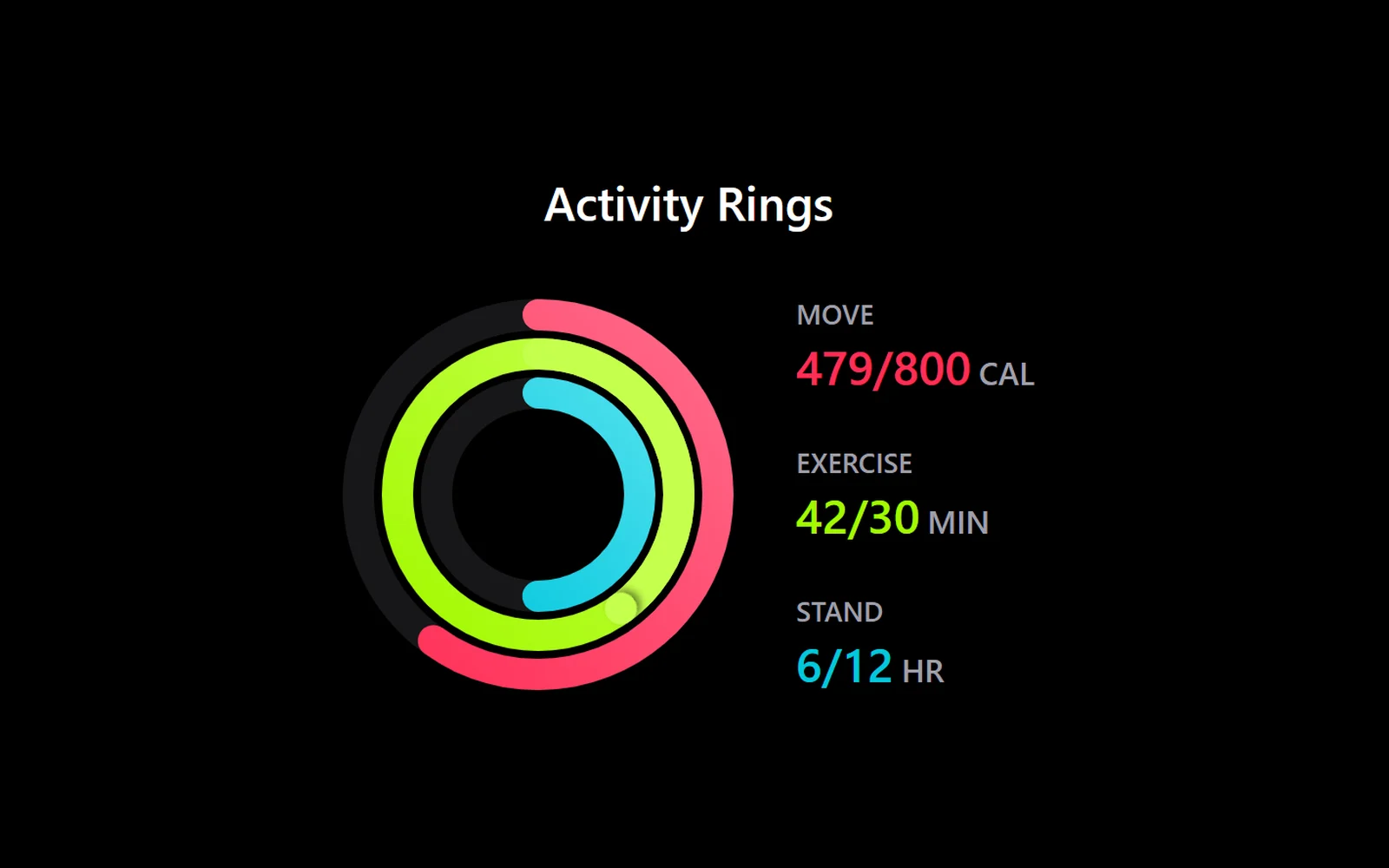
Кольца активности, как на фитнес-часах
React · Tailwind · Motion
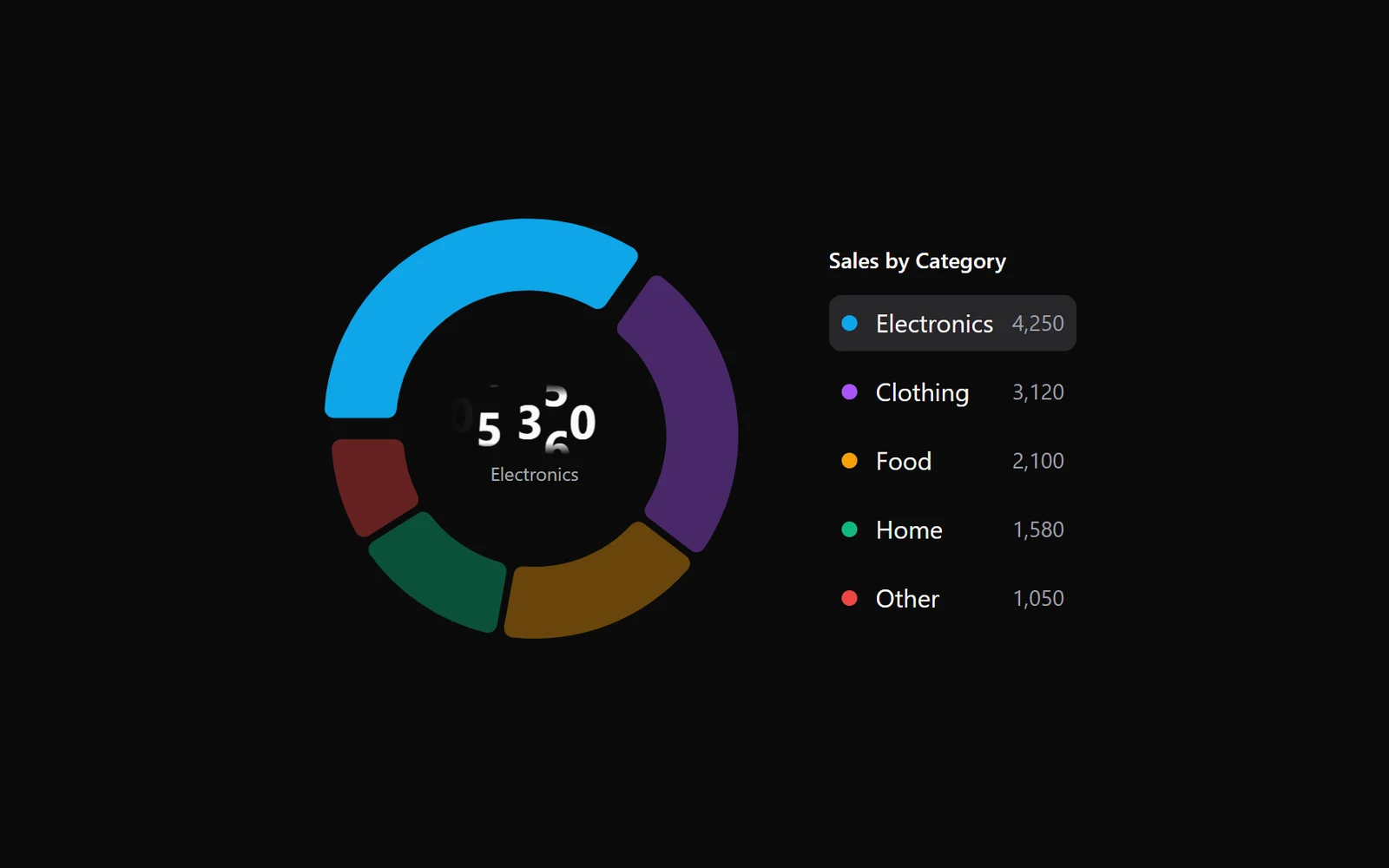
Кольцевая диаграмма с легендой и числом в центре
React · Tailwind · Motion
Выбор фона: экран рассыпается сеткой градиентов
GSAP · HTML/CSS
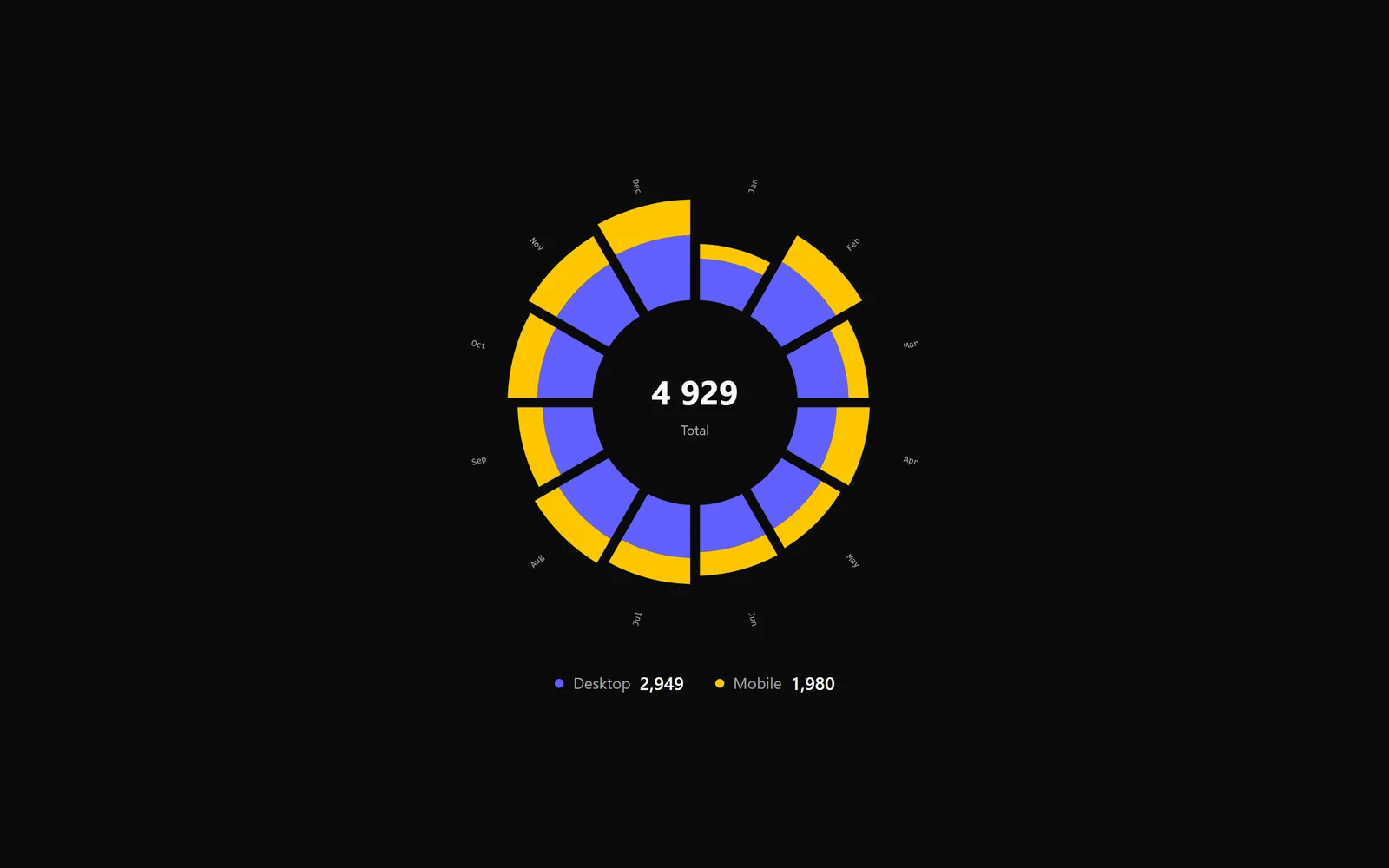
Радиальный график по месяцам
React · Tailwind · Motion