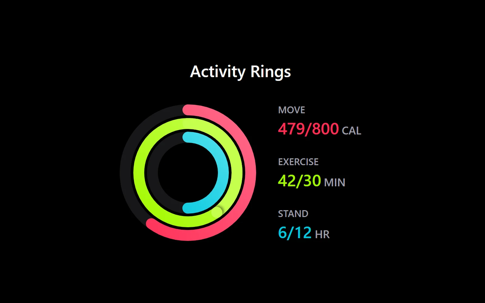
Три вложенных кольца прогресса, как на фитнес-часах: «движение», «упражнения» и «стояние». Когда карточка попадает в экран, кольца по очереди прорисовываются с градиентом, числа в легенде считаются вместе с ними, а при достижении цели на кольце вспыхивает импульс. Если цель перевыполнена, кольцо идёт на второй круг поверх первого с тенью у конца. Наведение на кольцо или строку легенды приглушает остальные. Подойдёт для дашборда привычек, фитнес-приложения, прогресса курса или выполнения плана продаж. Нужны React, Tailwind CSS v4 и Motion.
Библиотека дизайна / Компоненты
Кольца активности, как на фитнес-часах
Карточка с тремя кольцами прогресса: они прорисовываются по очереди, а цифры рядом считаются вместе с ними.
Промпт
Добавь в мой проект на React + Tailwind CSS v4 компонент «Кольца активности» (Apple Activity Card из Kokonut UI).

Установка: выполни `npx shadcn@latest add @kokonutui/apple-activity-card`. Если команда не подходит, создай файл `components/kokonutui/apple-activity-card.tsx` с кодом ниже. Нужна функция `cn` из `@/lib/utils` (пакеты `clsx` и `tailwind-merge`) и пакет `motion`. Строку `"use client"` в начале оставь, если проект на Next.js, в Vite её можно убрать.

Пропсы: `title`, `titleAs` (уровень заголовка), `activities` (массив колец снаружи внутрь: `{ label, color, colorEnd, size, current, target, unit }`) и `className`. `current` может быть больше `target` — тогда кольцо уходит на второй круг.

Подставь мои метрики вместо демо-данных `SAMPLE_ACTIVITIES`: например, три цели моего продукта (уроки, практика, дни подряд) или план продаж. Переведи заголовок «Activity Rings», подписи колец и единицы на русский, а также строку для экранных дикторов «… of …» в `progressLabel` и легенде («… из …»).

Цвета колец задаются полями `color` и `colorEnd`, подбери их под мой сайт. Карточка поддерживает светлую и тёмную тему (классы `dark:`); на светлом фоне яркие цвета автоматически затемняются.
Покажи, где её использовать на моей странице.
Код скопируется вместе с промптом
Код
"use client";

/**
 * @author: @kokonutui
 * @description: Apple Activity Card
 * @version: 1.1.0
 * @date: 2026-10-14
 * @license: MIT
 * @website: https://kokonutui.com
 * @github: https://github.com/kokonut-labs/kokonutui
 */

import {
  animate,
  MotionConfig,
  motion,
  useInView,
  useReducedMotion,
} from "motion/react";
import { type CSSProperties, useEffect, useId, useRef, useState } from "react";
import { cn } from "@/lib/utils";

export interface ActivityData {
  label: string;
  color: string;
  colorEnd: string;
  size: number;
  /** Can go past `target`: the ring keeps going for another lap. */
  current: number;
  target: number;
  unit: string;
}

const EASE_OUT = [0.23, 1, 0.32, 1] as const;
const STROKE = 16;
// Rings draw one after another, this far apart (s).
const STAGGER = 0.18;
// Time for the first lap; anything past the goal adds up to OVER_S more.
const DRAW_S = 1.2;
const OVER_S = 0.6;
// More than three laps would just be a solid ring.
const MAX_LAPS = 3;

const SAMPLE_ACTIVITIES: ActivityData[] = [
  {
    label: "MOVE",
    color: "#FF2D55",
    colorEnd: "#FF6B8B",
    size: 200,
    current: 479,
    target: 800,
    unit: "CAL",
  },
  {
    label: "EXERCISE",
    color: "#A3F900",
    colorEnd: "#C5FF4D",
    size: 160,
    current: 42,
    target: 30,
    unit: "MIN",
  },
  {
    label: "STAND",
    color: "#04C7DD",
    colorEnd: "#4DDFED",
    size: 120,
    current: 6,
    target: 12,
    unit: "HR",
  },
];

/** Progress in laps (1 = goal), capped so a huge value stays legible. */
const ratioOf = (data: ActivityData) =>
  data.target > 0
    ? Math.min(Math.max(data.current / data.target, 0), MAX_LAPS)
    : 0;

/** Duration of one ring's draw; its count-up runs on the same clock. */
const drawSeconds = (ratio: number) =>
  DRAW_S + OVER_S * Math.min(Math.max(ratio - 1, 0), 1);

interface RingNodes {
  base: SVGCircleElement | null;
  lap: SVGCircleElement | null;
  cap: SVGGElement | null;
  pulse: SVGCircleElement | null;
  count: HTMLSpanElement | null;
}

/**
 * Write one frame of a ring's draw straight to the DOM: `p` is progress in
 * laps. Past the goal the first lap stays full and a second circle draws
 * the overflow on top of it, led by a shadowed end cap, as on the Watch.
 */
function paintRing(
  nodes: RingNodes,
  data: Pick<ActivityData, "size" | "current">,
  p: number,
  ratio: number
) {
  const radius = (data.size - STROKE) / 2;
  const circumference = radius * 2 * Math.PI;
  nodes.base?.setAttribute(
    "stroke-dashoffset",
    `${(1 - Math.min(p, 1)) * circumference}`
  );
  const over = p > 1;
  // How far into the latest lap; a whole number of laps is a full lap.
  const rest = over ? p - Math.floor(p) || 1 : 0;
  if (nodes.lap) {
    nodes.lap.setAttribute(
      "stroke-dashoffset",
      `${(1 - rest) * circumference}`
    );
    nodes.lap.style.opacity = over ? "1" : "0";
  }
  if (nodes.cap) {
    nodes.cap.style.transform = `rotate(${rest * 360}deg)`;
    nodes.cap.style.opacity = over ? "1" : "0";
  }
  if (nodes.count) {
    // Count in step with the ring, landing exactly on the real value.
    nodes.count.textContent =
      p >= ratio
        ? `${data.current}`
        : `${Math.round((p / ratio) * data.current)}`;
  }
}

function CircleProgress({
  data,
  index,
  inView,
  reduceMotion,
  dimmed,
  onActive,
  countRef,
}: {
  data: ActivityData;
  index: number;
  inView: boolean;
  reduceMotion: boolean;
  dimmed: boolean;
  onActive: (active: boolean) => void;
  countRef: { current: HTMLSpanElement | null };
}) {
  const radius = (data.size - STROKE) / 2;
  const circumference = radius * 2 * Math.PI;
  const center = data.size / 2;
  const ratio = ratioOf(data);
  const progressLabel = `${data.label}: ${data.current} of ${data.target} ${data.unit}, ${Math.round(ratio * 100)}%`;

  const gradientId = useId();
  const shadowId = useId();
  const nodes = useRef<RingNodes>({
    base: null,
    lap: null,
    cap: null,
    pulse: null,
    count: null,
  });

  // Where the ring last stood, so new values carry on from there instead of
  // redrawing from empty. Null until the first draw.
  const shown = useRef<number | null>(null);
  // Keyed on the values, not the object: a parent re-rendering with the same
  // numbers in a fresh array must not restart the draw.
  const { size, current } = data;

  useEffect(() => {
    if (!inView) {
      return;
    }
    const ringNodes = { ...nodes.current, count: countRef.current };
    const ring = { size, current };
    if (reduceMotion || ratio === 0) {
      paintRing(ringNodes, ring, ratio, ratio);
      shown.current = ratio;
      return;
    }
    const from = shown.current;
    // First draw: start from zero right away, so the number doesn't show its
    // final value while the ring waits for its turn.
    if (from === null) {
      paintRing(ringNodes, ring, 0, ratio);
    }
    let pulsed = (from ?? 0) >= 1;
    const controls = animate(from ?? 0, ratio, {
      duration: drawSeconds(ratio),
      delay: from === null ? index * STAGGER : 0,
      ease: EASE_OUT,
      onUpdate: (p) => {
        shown.current = p;
        paintRing(ringNodes, ring, p, ratio);
        // The goal is hit: the cap pulses once at the top of the ring.
        if (!pulsed && p >= 1) {
          pulsed = true;
          ringNodes.pulse?.animate(
            [
              { transform: "scale(1)", opacity: 0.6 },
              { transform: "scale(2.4)", opacity: 0 },
            ],
            { duration: 560, easing: "cubic-bezier(0.23, 1, 0.32, 1)" }
          );
        }
      },
    });
    return () => controls.stop();
  }, [inView, reduceMotion, size, current, ratio, index, countRef]);

  return (
    <motion.div
      animate={inView ? { opacity: 1, transform: "scale(1)" } : undefined}
      className="pointer-events-none absolute inset-0 flex items-center justify-center"
      initial={{ opacity: 0, transform: "scale(0.96)" }}
      transition={{ duration: 0.3, delay: index * STAGGER, ease: EASE_OUT }}
    >
      {/* biome-ignore lint/a11y: the ring is focusable so keyboard users get the same focus dimming as hover; it has no action of its own. */}
      <svg
        aria-label={progressLabel}
        className={cn(
          "-rotate-90 overflow-visible rounded-full outline-none transition-opacity duration-200 ease-out focus-visible:ring-2 focus-visible:ring-zinc-400",
          // Neon hues wash out on white, so light mode caps their lightness
          // (hue and chroma kept) and the gradient deepens instead of fading.
          "[--ring-from:oklch(from_var(--ring)_min(l,0.8)_c_h)] [--ring-to:oklch(from_var(--ring)_min(l,0.7)_c_h)]",
          "dark:[--ring-from:var(--ring)] dark:[--ring-to:var(--ring-end)]",
          dimmed && "opacity-25"
        )}
        height={data.size}
        onBlur={() => onActive(false)}
        onFocus={() => onActive(true)}
        role="img"
        style={
          { "--ring": data.color, "--ring-end": data.colorEnd } as CSSProperties
        }
        // biome-ignore lint/a11y/noNoninteractiveTabindex: see above; focus only dims the other rings.
        tabIndex={0}
        viewBox={`0 0 ${data.size} ${data.size}`}
        width={data.size}
      >
        <title>{progressLabel}</title>
        <defs>
          <linearGradient id={gradientId} x1="0%" x2="100%" y1="0%" y2="100%">
            <stop offset="0%" style={{ stopColor: "var(--ring-from)" }} />
            <stop offset="100%" style={{ stopColor: "var(--ring-to)" }} />
          </linearGradient>
          {/* Lets the second lap read as lying on top of the first. */}
          <filter height="300%" id={shadowId} width="300%" x="-100%" y="-100%">
            <feDropShadow
              dx="0"
              dy="-2.5"
              floodColor="#000"
              floodOpacity="0.5"
              stdDeviation="2"
            />
          </filter>
        </defs>

        {/* The track is the ring's hover target, so each ring only reacts
            over its own band. */}
        <circle
          className="text-zinc-200/60 dark:text-zinc-800/60"
          cx={center}
          cy={center}
          fill="none"
          onPointerEnter={(event) => {
            if (event.pointerType === "mouse") {
              onActive(true);
            }
          }}
          onPointerLeave={() => onActive(false)}
          pointerEvents="stroke"
          r={radius}
          stroke="currentColor"
          strokeWidth={STROKE}
        />
        <circle
          cx={center}
          cy={center}
          fill="none"
          pointerEvents="none"
          r={radius}
          ref={(node) => {
            nodes.current.base = node;
          }}
          stroke={`url(#${gradientId})`}
          strokeDasharray={circumference}
          strokeDashoffset={circumference}
          strokeLinecap="round"
          strokeWidth={STROKE}
        />
        <circle
          cx={center}
          cy={center}
          fill="none"
          pointerEvents="none"
          r={radius}
          ref={(node) => {
            nodes.current.lap = node;
          }}
          strokeDasharray={circumference}
          strokeDashoffset={circumference}
          strokeLinecap="round"
          strokeWidth={STROKE}
          style={{ opacity: 0, stroke: "var(--ring-to)" }}
        />
        {/* End cap of the overflow lap; its shadow shows it passing over
            the start of the ring. */}
        <g
          pointerEvents="none"
          ref={(node) => {
            nodes.current.cap = node;
          }}
          style={{
            opacity: 0,
            transformBox: "view-box",
            transformOrigin: "center",
          }}
        >
          <circle
            cx={center + radius}
            cy={center}
            filter={`url(#${shadowId})`}
            r={STROKE / 2}
            style={{ fill: "var(--ring-to)" }}
          />
        </g>
        {/* Goal pulse, at the top of the ring where the first lap closes. */}
        <circle
          cx={center + radius}
          cy={center}
          fill="none"
          pointerEvents="none"
          r={STROKE / 2}
          ref={(node) => {
            nodes.current.pulse = node;
          }}
          strokeWidth={2}
          style={{
            opacity: 0,
            stroke: "var(--ring-to)",
            transformBox: "fill-box",
            transformOrigin: "center",
          }}
        />
      </svg>
    </motion.div>
  );
}

function DetailedActivityInfo({
  activities,
  inView,
  active,
  onActive,
  countRefs,
}: {
  activities: ActivityData[];
  inView: boolean;
  active: number | null;
  onActive: (index: number | null) => void;
  countRefs: { current: HTMLSpanElement | null }[];
}) {
  return (
    <motion.ul
      animate={
        inView ? { opacity: 1, transform: "translateX(0px)" } : undefined
      }
      className="flex flex-col gap-6"
      initial={{ opacity: 0, transform: "translateX(16px)" }}
      transition={{ duration: 0.5, delay: 0.3, ease: EASE_OUT }}
    >
      {activities.map((activity, index) => (
        <li
          className={cn(
            "flex flex-col transition-opacity duration-200 ease-out",
            active !== null && active !== index && "opacity-40"
          )}
          key={activity.label}
          onPointerEnter={(event) => {
            if (event.pointerType === "mouse") {
              onActive(index);
            }
          }}
          onPointerLeave={() => onActive(null)}
        >
          <span className="font-medium text-sm text-zinc-600 dark:text-zinc-400">
            {activity.label}
          </span>
          {/* The ring hues are too light for text on white, so light mode
              sets them to a fixed, deeper lightness with the same hue and
              chroma (3:1 or better for this large text). */}
          <span
            className="font-semibold text-2xl text-[oklch(from_var(--activity-color)_0.6_c_h)] tabular-nums dark:text-(--activity-color)"
            style={{ "--activity-color": activity.color } as CSSProperties}
          >
            <span className="sr-only">
              {activity.current} of {activity.target} {activity.unit}
            </span>
            <span aria-hidden="true">
              <span
                ref={(node) => {
                  const slot = countRefs[index];
                  if (slot) {
                    slot.current = node;
                  }
                }}
              >
                {activity.current}
              </span>
              /{activity.target}
              <span className="ml-1 text-base text-zinc-600 dark:text-zinc-400">
                {activity.unit}
              </span>
            </span>
          </span>
        </li>
      ))}
    </motion.ul>
  );
}

export default function AppleActivityCard({
  title = "Activity Rings",
  titleAs = "h2",
  activities = SAMPLE_ACTIVITIES,
  className,
}: {
  title?: string;
  /** Heading level for the title, to fit the page outline. */
  titleAs?: "h1" | "h2" | "h3" | "h4" | "h5" | "h6";
  /** Rings, outermost first. Defaults to sample data. */
  activities?: ActivityData[];
  className?: string;
}) {
  const ref = useRef<HTMLDivElement>(null);
  const Heading = motion[titleAs];
  const boxSize = activities.length
    ? Math.max(...activities.map((activity) => activity.size))
    : 0;
  const inView = useInView(ref, { once: true, margin: "-40px" });
  const reduceMotion = useReducedMotion() ?? false;
  const [active, setActive] = useState<number | null>(null);
  // The legend's numbers, counted up by the ring that owns them.
  const countRefs = useRef<{ current: HTMLSpanElement | null }[]>([]);
  countRefs.current = activities.map(
    (_, index) => countRefs.current[index] ?? { current: null }
  );

  return (
    <div
      className={cn(
        "@container relative mx-auto w-full max-w-3xl rounded-3xl p-8",
        "text-zinc-900 dark:text-white",
        className
      )}
      ref={ref}
    >
      {/* Reduced motion keeps the fades and drops the scale/slide. */}
      <MotionConfig reducedMotion="user">
        <div className="flex flex-col items-center gap-8">
          <Heading
            animate={
              inView ? { opacity: 1, transform: "translateY(0px)" } : undefined
            }
            className="font-medium text-2xl text-zinc-900 dark:text-white"
            initial={{ opacity: 0, transform: "translateY(-12px)" }}
            transition={{ duration: 0.5, ease: EASE_OUT }}
          >
            {title}
          </Heading>

          <div className="flex @md:flex-row flex-col items-center gap-8">
            <div
              className="relative shrink-0"
              style={{ width: boxSize, height: boxSize }}
            >
              {activities.map((activity, index) => (
                <CircleProgress
                  countRef={countRefs.current[index]}
                  data={activity}
                  dimmed={active !== null && active !== index}
                  index={index}
                  inView={inView}
                  key={activity.label}
                  onActive={(on) =>
                    setActive((prev) => {
                      if (on) {
                        return index;
                      }
                      return prev === index ? null : prev;
                    })
                  }
                  reduceMotion={reduceMotion}
                />
              ))}
            </div>
            <DetailedActivityInfo
              active={active}
              activities={activities}
              countRefs={countRefs.current}
              inView={inView}
              onActive={setActive}
            />
          </div>
        </div>
      </MotionConfig>
    </div>
  );
}
Похожие
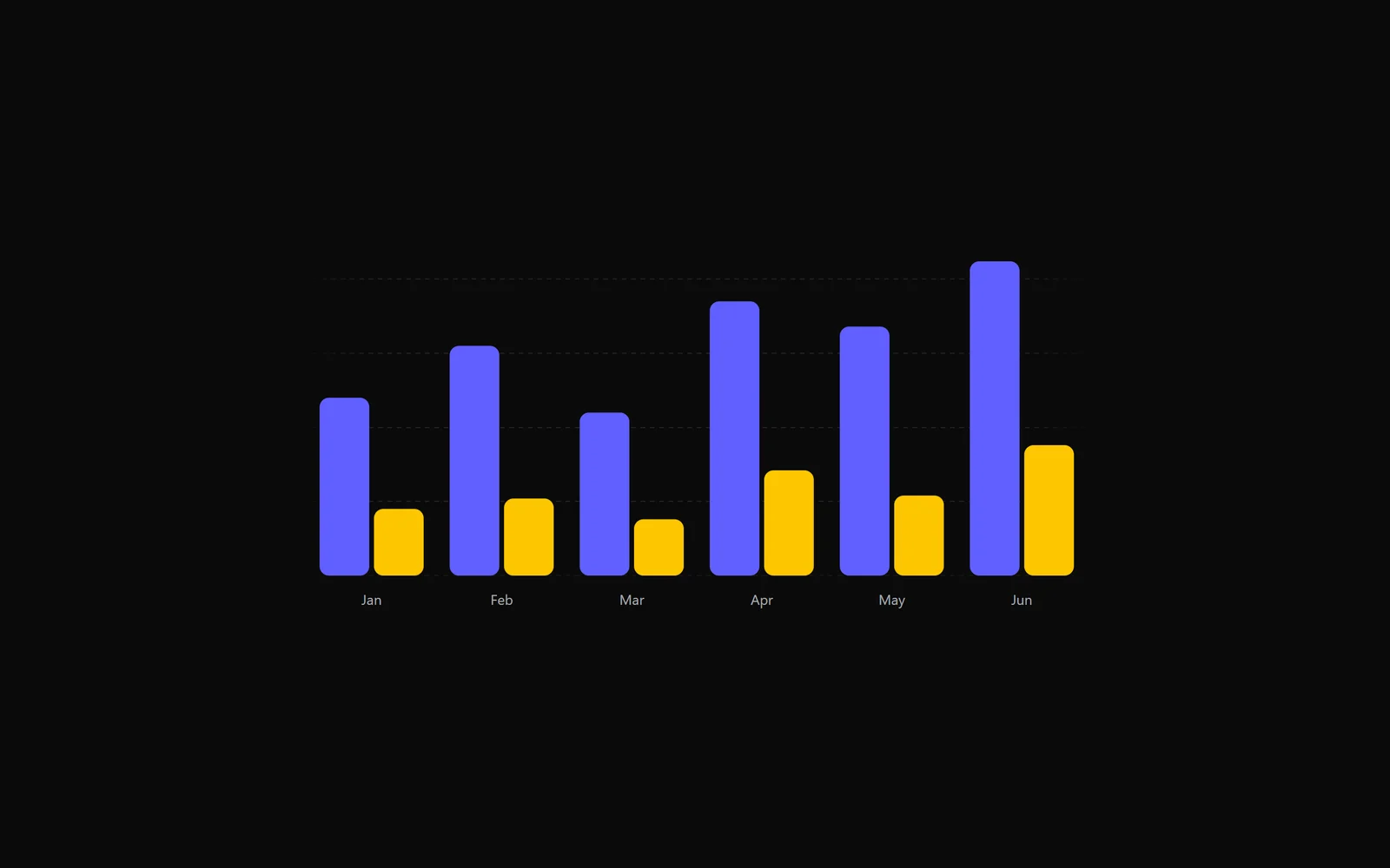
Столбчатый график с пружинной анимацией
React · Tailwind · Motion
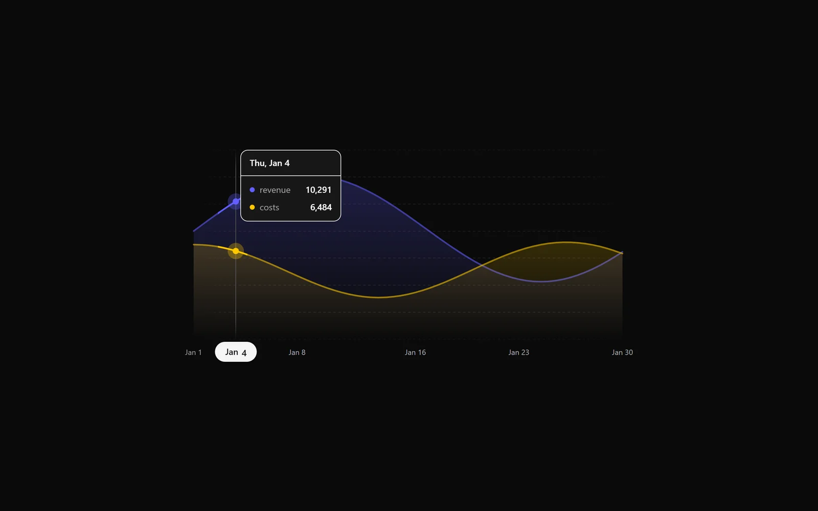
График с областями: выручка и расходы по дням
React · Tailwind · Motion
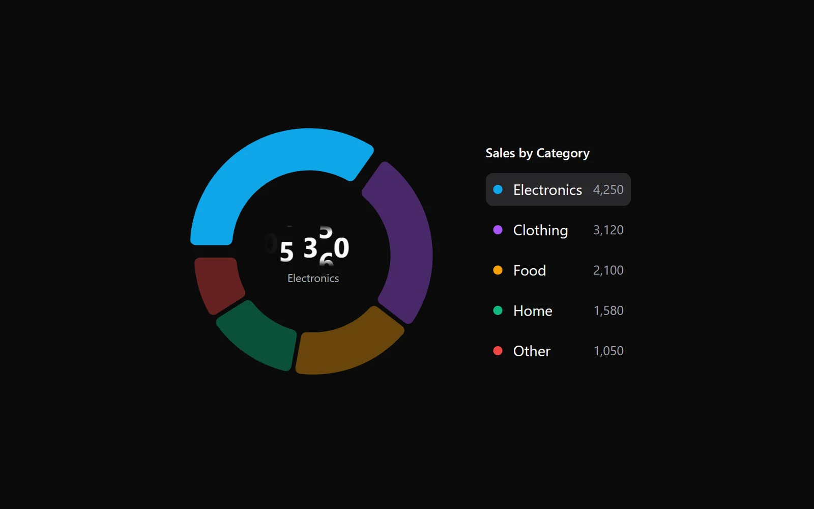
Кольцевая диаграмма с легендой и числом в центре
React · Tailwind · Motion
Выбор фона: экран рассыпается сеткой градиентов
GSAP · HTML/CSS