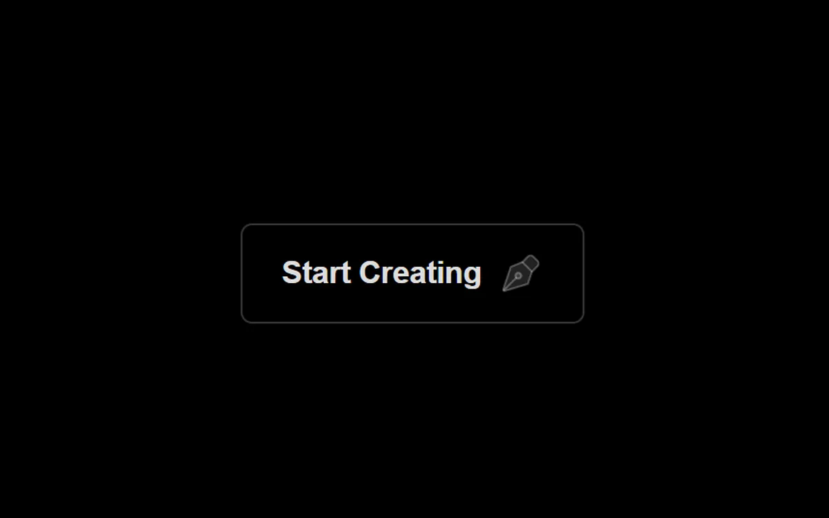
Тёмная кнопка «Start Creating» с иконкой. При наведении по углам по очереди прибегают четыре точки, между ними рисуется штриховая рамка, а внутри проступает тонкая диагональная сетка; сама кнопка наливается синим и слегка растёт. Подходит для главного призыва к действию на тёмном лендинге. Вся анимация на CSS. Код адаптирован: служебная обёртка с чёрным фоном убрана.
Библиотека дизайна / Компоненты
Кнопка с точками и рамкой
Тёмная кнопка: при наведении по углам бегут точки, штриховая рамка дорисовывается, а фон заполняется тонкой сеткой.
Промпт
Добавь в мой проект элемент «Кнопка с точками и рамкой» (Aura, автор Sourasith Phomhome). Вот HTML и CSS ниже: это готовая вёрстка, скрипты не нужны. Если проект на React — перенеси в компонент, `class` замени на `className`, а блок `<style>` вынеси в CSS-файл проекта. Все стили привязаны к классу `.btn-wrapper`, настройки лежат в CSS-переменных на самой ссылке (`--dot-size`, `--line-weight`, `--animation-speed`, `--dot-color`, `--line-color`, `--grid-color`). Эффект работает через `:has(.btn:hover)`, он поддерживается во всех современных браузерах. Если имена классов `btn`, `dot`, `line` совпадают с твоими — добавь префикс.

Подстрой под мой сайт: текст «Start Creating» замени на нужный призыв, цвет заливки при наведении `#25358b` — на акцентный цвет сайта, скорость — через `--animation-speed`. Кнопка рассчитана на тёмный фон: на светлом поменяй белые полупрозрачные цвета (`#fffa`, `#fff3`, `#fffd`) на тёмные. Ссылку `href="#"` замени на настоящий адрес.
Покажи, где его использовать на моей странице.
Код скопируется вместе с промптом
Код
<a href="#" class="btn-wrapper" style="--dot-size: 8px; --line-weight: 1px; --line-distance: 0.8rem 1rem; --animation-speed: 0.35s; --dot-color: #fffa; --line-color: #fffa; --grid-color: #fff3; position: relative; display: inline-flex; justify-content: center; align-items: center; width: auto; height: auto; padding: var(--line-distance); background-color: rgba(0, 0, 0, 0); user-select: none">
  <style>
    .btn-wrapper::after {
      content: "";
      position: absolute;
      top: 0;
      left: 0;
      width: 100%;
      height: 100%;
      border-radius: inherit;
      pointer-events: none;
      background-color: #0000;
      background-image: repeating-linear-gradient(45deg, var(--grid-color) 0 1px, transparent 2px 5px);
      opacity: 0;
      z-index: -1;
    }

    .btn-wrapper:has(.btn:hover)::after {
      animation: opacity-anim calc(var(--animation-speed) * 4) ease-in-out forwards;
    }

    @keyframes opacity-anim {
      80% {
        opacity: 0;
      }

      100% {
        opacity: 1;
      }
    }

    .btn-wrapper .btn {
      position: relative;
      display: flex;
      justify-content: center;
      align-items: center;
      padding: 0.8rem 1.25rem;
      background-color: #fff0;
      border: 1px solid var(--grid-color);
      color: #fffd;
      font-family: "Inter", sans-serif;
      letter-spacing: -0.01em;
      font-size: 1rem;
      font-weight: 600;
      text-transform: capitalize;
      border-radius: 6px;
      cursor: pointer;
      transition: transform .2s ease-in-out, letter-spacing .2s ease-in-out;
    }

    .btn-wrapper .btn:hover {
      background-color: #25358b;
      color: #fff;
      transform: scale(1.05);
      letter-spacing: .06em;
    }

    .btn-wrapper .btn:active {
      background-color: #25358b;
      transform: scale(.98);
      letter-spacing: .02em;
    }

    .btn-wrapper .btn-svg {
      margin-left: .5rem;
      height: 24px;
      stroke-width: 1;
      stroke-linecap: round;
      stroke-linejoin: round;
      stroke: #fff4;
      fill: #fff2;
      transition: all .2s ease-in-out;
    }

    .btn-wrapper .btn:hover .btn-svg {
      stroke: #fffa;
      fill: #fff3;
    }

    .btn-wrapper .dot {
      position: absolute;
      width: var(--dot-size);
      aspect-ratio: 1;
      border-radius: 2px;
      background-color: var(--dot-color);
      transition: all .3s ease-in-out;
      opacity: 0;
    }

    .btn-wrapper:has(.btn:hover) .dot.top.left {
      top: 50%;
      left: 20%;
      animation: move-top-left var(--animation-speed) ease-in-out forwards;
    }

    @keyframes move-top-left {
      90% {
        opacity: .6;
      }

      100% {
        top: calc(var(--dot-size) * -0.5);
        left: calc(var(--dot-size) * -0.5);
        opacity: 1;
      }
    }

    .btn-wrapper:has(.btn:hover) .dot.top.right {
      top: 50%;
      right: 20%;
      animation: move-top-right var(--animation-speed) ease-in-out forwards;
      animation-delay: calc(var(--animation-speed)*.6);
    }

    @keyframes move-top-right {
      80% {
        opacity: .6;
      }

      100% {
        top: calc(var(--dot-size) * -0.5);
        right: calc(var(--dot-size) * -0.5);
        opacity: 1;
      }
    }

    .btn-wrapper:has(.btn:hover) .dot.bottom.right {
      bottom: 50%;
      right: 20%;
      animation: move-bottom-right var(--animation-speed) ease-in-out forwards;
      animation-delay: calc(var(--animation-speed)*1.2);
    }

    @keyframes move-bottom-right {
      80% {
        opacity: .6;
      }

      100% {
        bottom: calc(var(--dot-size) * -0.5);
        right: calc(var(--dot-size) * -0.5);
        opacity: 1;
      }
    }

    .btn-wrapper:has(.btn:hover) .dot.bottom.left {
      bottom: 50%;
      left: 20%;
      animation: move-bottom-left var(--animation-speed) ease-in-out forwards;
      animation-delay: calc(var(--animation-speed)*1.8);
    }

    @keyframes move-bottom-left {
      80% {
        opacity: .6;
      }

      100% {
        bottom: calc(var(--dot-size) * -0.5);
        left: calc(var(--dot-size) * -0.5);
        opacity: 1;
      }
    }

    .btn-wrapper .line {
      position: absolute;
      transition: all .3s ease-in-out;
    }

    .btn-wrapper .line.horizontal {
      height: var(--line-weight);
      width: 100%;
      background-image: repeating-linear-gradient(90deg, #0000 0 calc(var(--line-weight)*2), var(--line-color) calc(var(--line-weight)*2) calc(var(--line-weight)*4));
    }

    .btn-wrapper .line.top {
      top: calc(var(--line-weight)*-0.5);
      transform-origin: top left;
      transform: rotate(5deg) scaleX(0);
    }

    .btn-wrapper:has(.btn:hover) .line.top {
      animation: draw-top var(--animation-speed) ease-in-out forwards;
      animation-delay: calc(var(--animation-speed)*.8);
    }

    @keyframes draw-top {
      100% {
        transform: rotate(0deg) scaleX(1);
      }
    }

    .btn-wrapper .line.bottom {
      bottom: calc(var(--line-weight)*-0.5);
      transform-origin: bottom right;
      transform: rotate(5deg) scaleX(0);
    }

    .btn-wrapper:has(.btn:hover) .line.bottom {
      animation: draw-bottom var(--animation-speed) ease-in-out forwards;
      animation-delay: calc(var(--animation-speed)*2);
    }

    @keyframes draw-bottom {
      100% {
        transform: rotate(0deg) scaleX(1);
      }
    }

    .btn-wrapper .line.vertical {
      width: var(--line-weight);
      height: 100%;
      background-image: repeating-linear-gradient(0deg, #0000 0 calc(var(--line-weight)*2), var(--line-color) calc(var(--line-weight)*2) calc(var(--line-weight)*4));
    }

    .btn-wrapper .line.left {
      left: calc(var(--line-weight)*-0.5);
      transform-origin: bottom left;
      transform: rotate(0deg) scaleY(0);
    }

    .btn-wrapper:has(.btn:hover) .line.left {
      animation: draw-left var(--animation-speed) ease-in-out forwards;
      animation-delay: calc(var(--animation-speed)*2.4);
    }

    @keyframes draw-left {
      100% {
        transform: rotate(0deg) scaleY(1);
      }
    }

    .btn-wrapper .line.right {
      right: calc(var(--line-weight)*-0.5);
      transform-origin: top right;
      transform: rotate(5deg) scaleY(0);
    }

    .btn-wrapper:has(.btn:hover) .line.right {
      animation: draw-right var(--animation-speed) ease-in-out forwards;
      animation-delay: calc(var(--animation-speed)*1.4);
    }

    @keyframes draw-right {
      100% {
        transform: rotate(0deg) scaleY(1);
      }
    }
  </style>

  <div class="line horizontal top"></div>
  <div class="line vertical right"></div>
  <div class="line horizontal bottom"></div>
  <div class="line vertical left"></div>

  <div class="dot top left"></div>
  <div class="dot top right"></div>
  <div class="dot bottom right"></div>
  <div class="dot bottom left"></div>

  <button class="btn">
            <span class="btn-text">Start Creating</span>
            <svg class="btn-svg" viewBox="0 0 24 24" xmlns="http://www.w3.org/2000/svg">
              <path d="M17.6744 11.4075L15.7691 17.1233C15.7072 17.309 15.5586 17.4529 15.3709 17.5087L3.69348 20.9803C3.22819 21.1186 2.79978 20.676 2.95328 20.2155L6.74467 8.84131C6.79981 8.67588 6.92419 8.54263 7.08543 8.47624L12.472 6.25822C12.696 6.166 12.9535 6.21749 13.1248 6.38876L17.5294 10.7935C17.6901 10.9542 17.7463 11.1919 17.6744 11.4075Z" class=""></path>
              <path d="M3.2959 20.6016L9.65986 14.2376" class=""></path>
              <path d="M17.7917 11.0557L20.6202 8.22724C21.4012 7.44619 21.4012 6.17986 20.6202 5.39881L18.4989 3.27749C17.7178 2.49645 16.4515 2.49645 15.6704 3.27749L12.842 6.10592" class=""></path>
              <path d="M11.7814 12.1163C11.1956 11.5305 10.2458 11.5305 9.66004 12.1163C9.07426 12.7021 9.07426 13.6519 9.66004 14.2376C10.2458 14.8234 11.1956 14.8234 11.7814 14.2376C12.3671 13.6519 12.3671 12.7021 11.7814 12.1163Z" class=""></path>
            </svg>
          </button>
</a>
Похожие
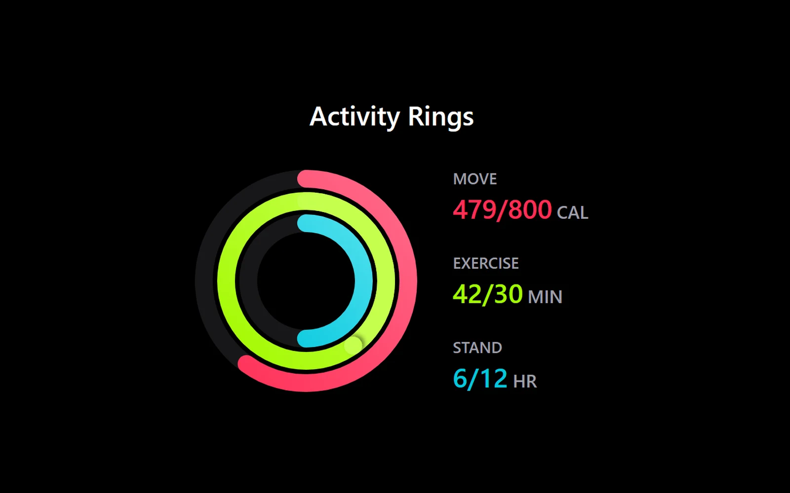
Кольца активности, как на фитнес-часах
React · Tailwind · Motion
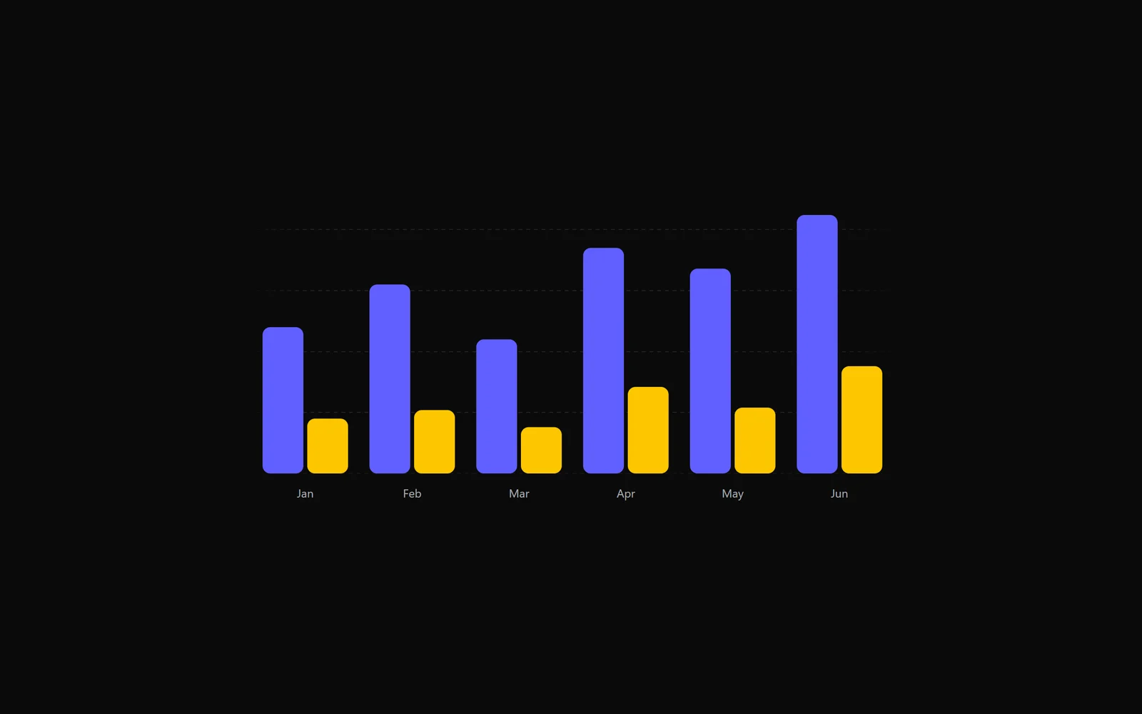
Столбчатый график с пружинной анимацией
React · Tailwind · Motion
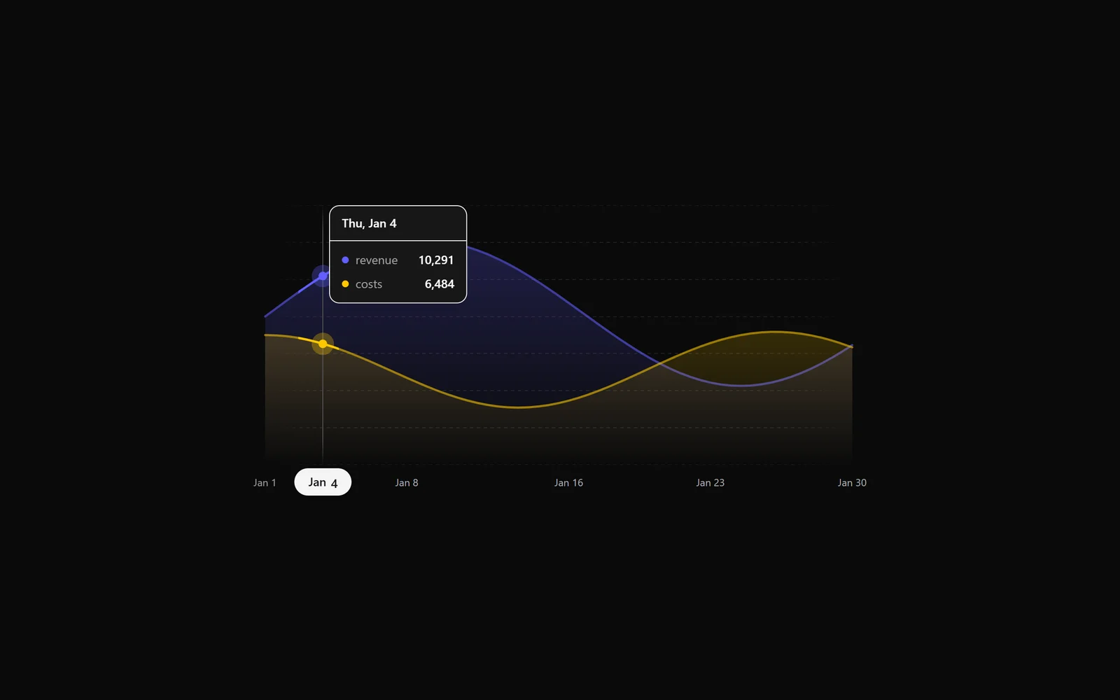
График с областями: выручка и расходы по дням
React · Tailwind · Motion
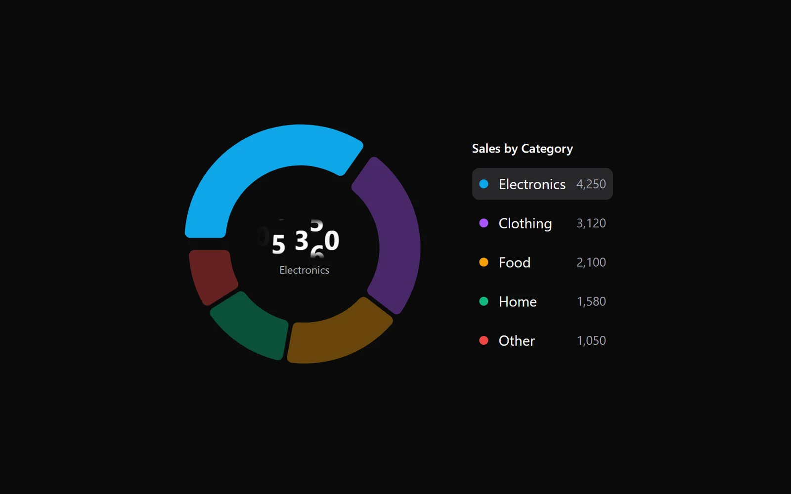
Кольцевая диаграмма с легендой и числом в центре
React · Tailwind · Motion