Неоновое слово, которое переливается, мерцает и тянется к курсору
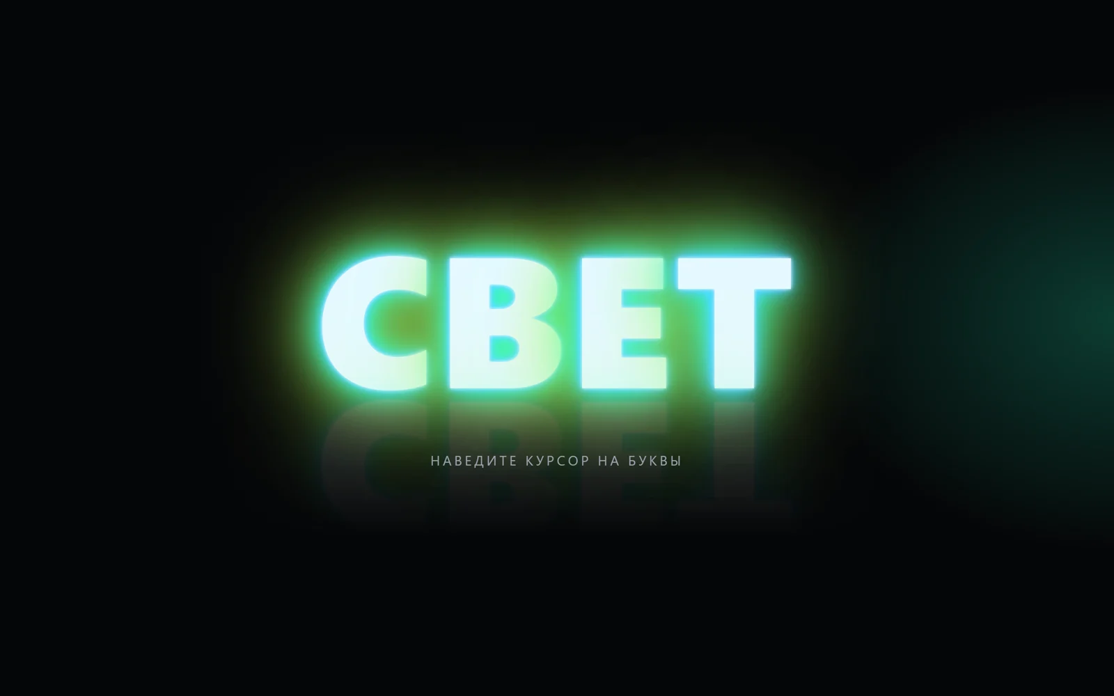
Слово светится, как неоновая трубка: ореол из бирюзы, зелени и жёлтого, перелив цвета, мерцание букв и яркость от курсора.
Промпт
Добавь на мою страницу эффект «Неоновое слово, которое переливается, мерцает и тянется к курсору» (Сергей Дургалян, MIT). Ниже готовая страница без библиотек: HTML, CSS и чистый JavaScript. Сначала перенеси её как есть и проверь: слово «СВЕТ» светится трёхцветным ореолом, цвет медленно переливается, буквы изредка моргают, у курсора разгораются ярче; без мыши невидимый курсор сам водит по слову. Потом меняй.

Как устроен код. Слово стоит в `h1.word` с `aria-label`; скрипт разбивает его на буквы `.ch` и делает такую же копию в `.reflection` (перевёрнутое отражение под словом с маской-градиентом и `padding`, чтобы ореол не обрезался прямоугольником). Свечение буквы — это `text-shadow` из семи слоёв: белая сердцевина, два слоя `--g1` (бирюзовый), два `--g2` (зелёный) и два `--g3` (жёлтый), их размытие умножается на переменную `--k`, а сдвиг — на `--dx`/`--dy`. В цикле `requestAnimationFrame` положение курсора сглаживается, для каждой буквы считается расстояние до него в пределах `RADIUS` от диагонали экрана: чем ближе, тем больше `--k` (шире и ярче ореол) и сильнее сдвиг ореола от курсора; плюс лёгкое «дыхание» по синусу. Перелив — переменная `--hue`, которая качается в пределах `±HUE_SWING` и применяется как `filter: hue-rotate(...)` к слову и к пятну света `.ambient` (оно тоже следует за курсором). Мерцание — функция `flicker`: случайная буква и её отражение проигрывают ключевые кадры прозрачности `FLICKER` со ступенчатым `steps(12)`, следующая вспышка через случайную паузу из `FLICKER_EVERY`. Автодемо: если `IDLE_DEMO` мс нет движения мыши или касания, координаты курсора ведёт фигура Лиссажу по прямоугольнику слова.

Что менять: слово — текст и `aria-label` в `h1.word`; цвета ореола — `--g1`, `--g2`, `--g3` и цвет букв `--core`; размер — `font-size` у `.word`; силу свечения — множители `em` в `text-shadow` и диапазон `--k` (`.65 + near² × 1.05`); скорость и размах перелива — `HUE_SPEED` и `HUE_SWING` (0 — без перелива); частоту мерцания — `FLICKER_EVERY` и ключевые кадры `FLICKER`; зону реакции на курсор — `RADIUS`. Отражение можно убрать вместе с `.reflection` и массивом `echoes`.

Если проект на React: вынеси эффект в компонент `NeonWord` с пропсом `text`; буквы рендери из `[...text]`, ссылки на них собери через `ref` на контейнер. Цикл `requestAnimationFrame`, слушатели `pointermove`/`pointerdown` и таймеры мерцания заводи в `useEffect` и снимай в очистке (`cancelAnimationFrame`, `clearTimeout`). CSS-переменные пиши напрямую в `element.style`, не через состояние, иначе компонент будет перерисовываться каждый кадр. Не убирай ветку `prefers-reduced-motion`: в ней нет перелива, мерцания, «дыхания» и автодемо, остаётся ровное свечение, которое реагирует на курсор.
Покажи, где на моём сайте уместно такое неоновое слово, и предложи 3 слова и палитру ореола под мой бренд.
Код скопируется вместе с промптом
Почти чёрный экран, и на нём горит одно крупное слово «СВЕТ». Буквы белые в сердцевине, вокруг них ореол в три слоя: тонкий бирюзовый, шире зелёный и самый широкий жёлтый, как у неоновой вывески в тумане. Цвет ореола медленно переливается туда-обратно, буквы чуть «дышат», а иногда одна из них, как старая трубка, моргает и гаснет на долю секунды. Ближе к курсору буквы разгораются ярче и шире, ореол отклоняется от курсора, а по «стене» за словом ползёт мягкое цветное пятно. Под словом лежит бледное отражение на «полу». Без мыши невидимый курсор сам ходит восьмёркой по слову. Приём подсмотрен на butter.video.
Библиотек, картинок и canvas нет. Каждая буква — отдельный span с семью слоями text-shadow разного размера и цвета; размер и сдвиг слоёв зависят от CSS-переменных, которые скрипт меняет каждый кадр по расстоянию до курсора. Перелив — filter: hue-rotate, мерцание — короткая анимация прозрачности через Web Animations API. Слово можно заменить на любое, шрифт тоже любой с кириллицей. Подойдёт для первого экрана клуба, бара, музыкального проекта, вечеринки, промо ночной акции и любой тёмной страницы, где нужен один яркий акцент.
Код
<!-- MIT License. Copyright (c) 2026 Sergei Durgalian, learn.create-products.com/design. Free to use, copy and modify with this notice kept. -->
<!DOCTYPE html>
<html lang="ru">
<head>
<meta charset="UTF-8">
<meta name="viewport" content="width=device-width, initial-scale=1">
<title>Spectral glow text</title>
<style>
  :root {
    --bg: #050608;
    --core: #dffcff;   /* letter body */
    --g1: #2ee6ff;     /* inner halo */
    --g2: #3dff7a;     /* middle halo */
    --g3: #ffe14a;     /* outer halo */
    --hue: 0deg;       /* driven by JS: slow colour drift */
  }
  *, *::before, *::after { box-sizing: border-box; }
  html, body { height: 100%; margin: 0; }
  body {
    overflow: hidden; background: var(--bg); color: #9aa3ad;
    font-family: system-ui, -apple-system, "Segoe UI", sans-serif;
    display: grid; place-items: center; cursor: crosshair; touch-action: none;
  }
  /* soft coloured light on the "wall" behind the word, follows the pointer */
  .ambient {
    position: fixed; inset: 0; pointer-events: none;
    background: radial-gradient(40vmax 30vmax at var(--ax, 50%) var(--ay, 50%), rgba(61, 255, 122, .22), transparent 70%);
    filter: hue-rotate(var(--hue));
  }
  .scene { width: 100%; overflow-x: clip; text-align: center; padding: 0 16px; }
  .sign { position: relative; }
  .word {
    margin: 0; font-weight: 800; line-height: .9; letter-spacing: .02em;
    font-size: clamp(4.5rem, 21vw, 15rem);
    filter: hue-rotate(var(--hue));
  }
  /* each letter is a neon tube: white core + three halos of different size.
     --k (0.6..1.6) = how close the pointer is, --dx/--dy = direction to it */
  .ch {
    --k: 1; --dx: 0; --dy: 0;
    display: inline-block; color: var(--core);
    text-shadow:
      0 0 .02em #fff,
      calc(var(--dx) * -.02em) calc(var(--dy) * -.02em) calc(.05em * var(--k)) var(--g1),
      calc(var(--dx) * -.04em) calc(var(--dy) * -.04em) calc(.12em * var(--k)) var(--g1),
      calc(var(--dx) * -.07em) calc(var(--dy) * -.07em) calc(.24em * var(--k)) var(--g2),
      calc(var(--dx) * -.1em) calc(var(--dy) * -.1em) calc(.4em * var(--k)) var(--g2),
      calc(var(--dx) * -.14em) calc(var(--dy) * -.14em) calc(.7em * var(--k)) var(--g3),
      calc(var(--dx) * -.2em) calc(var(--dy) * -.2em) calc(1.1em * var(--k)) var(--g3);
  }
  /* floor reflection: the same word, flipped and faded */
  .reflection {
    /* padding keeps the halo inside the masked box, otherwise its edge shows as a rectangle */
    position: absolute; left: -40%; right: -40%; top: calc(100% - .6em); padding: .6em 0; pointer-events: none; user-select: none;
    transform: scaleY(-1); opacity: .2;
    -webkit-mask-image: linear-gradient(to top, #000 25%, transparent 65%);
    mask-image: linear-gradient(to top, #000 25%, transparent 65%);
  }
  .caption { margin: 4.5rem 0 0; font-size: clamp(.9rem, 1.6vw, 1.1rem); letter-spacing: .2em; text-transform: uppercase; position: relative; z-index: 1; }
</style>
</head>
<body>
<div class="ambient"></div>
<main class="scene">
  <div class="sign">
    <h1 class="word" aria-label="Свет">СВЕТ</h1>
    <div class="word reflection" aria-hidden="true"></div>
  </div>
  <p class="caption">Наведите курсор на буквы</p>
</main>

<script>
// Spectral neon text: stacked text-shadows per letter, slow hue drift,
// random tube flicker and pointer-driven intensity. No libraries, no images.
(() => {
  // settings
  const HUE_SPEED = 14;        // degrees per second of colour drift
  const HUE_SWING = 70;        // drift goes back and forth within ±HUE_SWING
  const RADIUS = 0.45;         // pointer influence radius, share of the screen diagonal
  const FLICKER_EVERY = [1800, 4200]; // random pause between flickers, ms
  const IDLE_DEMO = 2500;      // a virtual pointer takes over after this idle time, ms

  const reduceMotion = matchMedia('(prefers-reduced-motion: reduce)').matches;
  const root = document.documentElement;
  const word = document.querySelector('h1.word');
  const mirror = document.querySelector('.reflection');
  const text = word.textContent.trim();

  // split into letters (the h1 keeps aria-label, letters are hidden from screen readers)
  const makeLetters = (el) => {
    el.textContent = '';
    return [...text].map((c) => {
      const s = document.createElement('span');
      s.className = 'ch';
      s.textContent = c;
      s.setAttribute('aria-hidden', 'true');
      el.append(s);
      return s;
    });
  };
  const letters = makeLetters(word);
  const echoes = makeLetters(mirror);

  // pointer state: target (tx, ty) and smoothed (px, py)
  let tx = innerWidth / 2, ty = innerHeight * .3, px = tx, py = ty, lastInput = -1e9;
  addEventListener('pointermove', (e) => { tx = e.clientX; ty = e.clientY; lastInput = performance.now(); });
  addEventListener('pointerdown', (e) => { tx = e.clientX; ty = e.clientY; lastInput = performance.now(); });

  // neon flicker: a letter buzzes, dims and comes back (WAAPI, runs on the compositor)
  const FLICKER = [
    { opacity: 1 }, { opacity: .35, offset: .08 }, { opacity: 1, offset: .14 },
    { opacity: .2, offset: .22 }, { opacity: .9, offset: .3 }, { opacity: .5, offset: .5 }, { opacity: 1 }
  ];
  function flicker() {
    const i = Math.floor(Math.random() * letters.length);
    const opts = { duration: 700 + Math.random() * 500, easing: 'steps(12, end)' };
    letters[i].animate(FLICKER, opts);
    echoes[i].animate(FLICKER, opts);
    const [a, b] = FLICKER_EVERY;
    setTimeout(flicker, a + Math.random() * (b - a));
  }
  if (!reduceMotion) setTimeout(flicker, 900);

  let start = performance.now();
  function frame(now) {
    const t = (now - start) / 1000;

    // autodemo: without input a virtual pointer drifts over the word in a figure-eight
    if (now - lastInput > IDLE_DEMO && !reduceMotion) {
      const r = word.getBoundingClientRect();
      tx = r.left + r.width * (.5 + .55 * Math.sin(t * .9));
      ty = r.top + r.height * (.5 + .7 * Math.sin(t * 1.8));
    }
    const ease = reduceMotion ? 1 : .12;
    px += (tx - px) * ease;
    py += (ty - py) * ease;

    // colour drift: hue swings back and forth, so the palette never turns muddy
    const hue = reduceMotion ? 0 : Math.sin((t * HUE_SPEED / HUE_SWING)) * HUE_SWING;
    root.style.setProperty('--hue', hue.toFixed(1) + 'deg');
    root.style.setProperty('--ax', px + 'px');
    root.style.setProperty('--ay', py + 'px');

    // per-letter intensity: closer to the pointer = wider, brighter halo leaning away from it
    const reach = Math.hypot(innerWidth, innerHeight) * RADIUS;
    letters.forEach((el, i) => {
      const r = el.getBoundingClientRect();
      const dx = px - (r.left + r.width / 2), dy = py - (r.top + r.height / 2);
      const d = Math.hypot(dx, dy);
      const near = Math.max(0, 1 - d / reach);
      const breathe = reduceMotion ? 0 : .06 * Math.sin(t * 2.2 + i);
      const k = (.65 + near * near * 1.05 + breathe).toFixed(3);
      const nx = (d ? dx / d : 0) * near, ny = (d ? dy / d : 0) * near;
      el.style.setProperty('--k', k);
      el.style.setProperty('--dx', nx.toFixed(3));
      el.style.setProperty('--dy', ny.toFixed(3));
      echoes[i].style.setProperty('--k', k);
    });
    requestAnimationFrame(frame);
  }
  requestAnimationFrame(frame);
})();
</script>
</body>
</html>