Фото, которое рассыпается на осколки при наведении
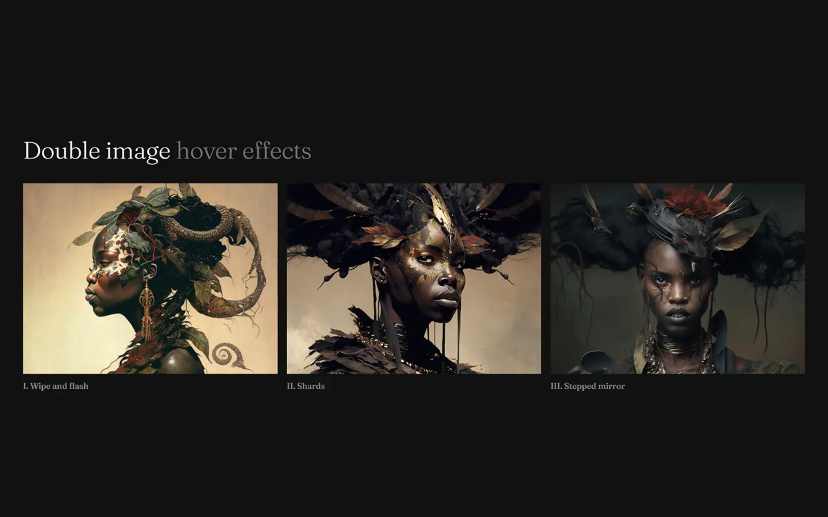
Три hover-эффекта для фото: шторка со вспышкой, разлёт на четыре осколка по диагоналям и ступенчатый «глитч».
Промпт
Добавь в мой проект эффект наведения «Фото, которое рассыпается на осколки» (по мотивам Codrops DoubleImageHoverEffects, MIT). Ниже готовая страница на чистом HTML, CSS и GSAP (скрипт `gsap.min.js` версии 3.13.0 с jsdelivr). Сначала перенеси её как есть и убедись, что три карточки реагируют на наведение, и только потом подгоняй под мой дизайн.

Как устроен код. Элемент `.double` получает картинку через `background-image`, а скрипт на старте заменяет содержимое элемента на несколько одинаковых слоёв `.double__img`, лежащих друг на друге (`grid-area: 1 / 1 / -1 / -1`). Базовый класс `Fx` создаёт слои и запускает таймлайн на `mouseenter`, а на `mouseleave` проигрывает обратный; прошлый таймлайн убивается, поэтому быстрое «зашёл и вышел» не дёргается. Эффект выбирается атрибутом `data-effect`: `wipe` (2 слоя, `clipPath` верхнего уезжает влево, нижний с `filter: brightness(400%) hue-rotate(190deg)` остывает), `shards` (9 слоёв: итоговая картинка, 4 фрагмента с разным `backgroundSize`, `backgroundPosition` и фильтром, 4 куска «обложки» с `clipPath` в виде треугольников, которые разъезжаются на `xPercent` и `yPercent`) и `steps` (верхний слой схлопывается с `ease: 'steps(6)'`, нижний отражён `scaleX: -0.97`). Для клавиатуры эффект включается и по фокусу (`focus-visible`).

Что менять: пути картинок в `style="background-image:url(...)"`, подписи, пропорции `.double` (`aspect-ratio`). Картинки должны быть шире высоты примерно как 4 к 3 и крупнее 800 пикселей: эффект `shards` увеличивает фото до 145 процентов. Скорость задают `duration` в `run()` и в `this.duration`, характер движения — параметр `ease`. Если нужен только один эффект, оставь один класс и один `data-effect`.

Если проект на React: сделай компонент `<DoubleImage src effect />` с `ref` на `.double`, создавай экземпляр класса эффекта в `useEffect` и вешай обработчики там же. В очистке эффекта убей таймлайн (`fx.tl?.kill()`) и сними слушатели; не пересоздавай слои на каждом рендере. Не убирай `overflow: hidden` у `.double`: на нём держатся разлетающиеся осколки. Не заменяй `clip-path` на `opacity`, иначе пропадёт сам эффект.
Покажи, на каких карточках моего сайта такое наведение будет уместно.
Код скопируется вместе с промптом
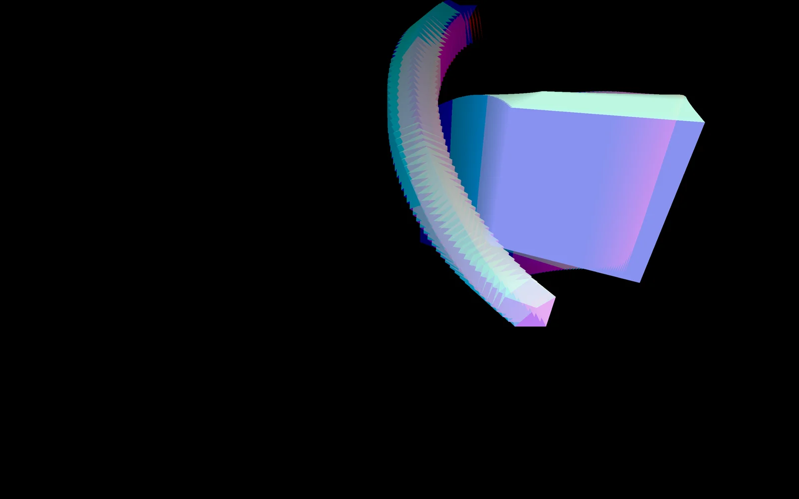
Три эффекта наведения на фотографию, у которых одна идея: картинка лежит в нескольких копиях, и при наведении верхняя копия убирается, открывая такую же, но иначе обработанную. В первом верхний слой уезжает влево по clip-path, а нижний остывает от яркой вспышки с поворотом оттенка. Во втором фото режется по диагоналям на четыре треугольника, они разлетаются в стороны, а под ними собираются в целую картинку четыре приближённых цветных фрагмента. В третьем слой схлопывается к нижнему краю шестью резкими шагами, открывая зеркальную копию.
Основа: GSAP-таймлайны, свойства clipPath, filter и backgroundSize, никакого WebGL. Хорошо ложатся на карточки портфолио, кейсы агентств, обложки статей и каталоги, где фотография должна «отвечать» на курсор.
Код
<!-- Pictures: /images/4.jpg, /images/2.jpg, /images/5.jpg (landscape, ~4:3, at least 800px wide) -->
<!DOCTYPE html>
<html lang="en">
<head>
<meta charset="UTF-8">
<meta name="viewport" content="width=device-width, initial-scale=1">
<title>Double Image Hover Effects</title>
<link rel="stylesheet" href="https://fonts.googleapis.com/css2?family=Fraunces:wght@300;500&display=swap">
<style>
*, *::before, *::after { box-sizing: border-box; }
body { margin: 0; min-height: 100vh; display: grid; place-items: center; background: #111; color: #f2efe8; font-family: "Fraunces", serif; }
#stage { width: min(1440px, 100%); padding: 72px 40px 56px; background: #111; }
.stage__title { margin: 0 0 32px; font-size: clamp(1.6rem, 3.2vw, 2.6rem); font-weight: 300; letter-spacing: -.01em; }
.stage__title span { opacity: .45; }
.cards { display: grid; grid-template-columns: repeat(3, 1fr); gap: 16px; }
.card figcaption { margin-top: 12px; font-size: .9rem; opacity: .55; }
.card { margin: 0; }
/* the element the effect is attached to */
.double { display: grid; aspect-ratio: 4 / 3; position: relative; overflow: hidden; cursor: pointer; }
.double:focus-visible { outline: 2px solid #ef5d36; outline-offset: 3px; }
/* every layer lies exactly over the others */
.double__img { grid-area: 1 / 1 / -1 / -1; width: 100%; height: 100%; position: relative; background: no-repeat 50% 50% / cover; }
</style>
</head>
<body>
<div id="stage">
  <h1 class="stage__title">Double image <span>hover effects</span></h1>
  <div class="cards">
    <!-- data-effect picks the effect class. The picture is set as a background-image; replace the paths with your own -->
    <figure class="card"><div class="double" tabindex="0" role="img" aria-label="Wipe" style="background-image:url(/images/4.jpg)" data-effect="wipe"></div><figcaption>I. Wipe and flash</figcaption></figure>
    <figure class="card"><div class="double" tabindex="0" role="img" aria-label="Shards" style="background-image:url(/images/2.jpg)" data-effect="shards"></div><figcaption>II. Shards</figcaption></figure>
    <figure class="card"><div class="double" tabindex="0" role="img" aria-label="Steps" style="background-image:url(/images/5.jpg)" data-effect="steps"></div><figcaption>III. Stepped mirror</figcaption></figure>
  </div>
</div>

<script src="https://cdn.jsdelivr.net/npm/gsap@3.13.0/dist/gsap.min.js"></script>
<script>
// Based on Codrops DoubleImageHoverEffects (MIT), https://github.com/codrops/DoubleImageHoverEffects
const FULL = 'polygon(0% 0%, 100% 0%, 100% 100%, 0% 100%)';

// Base class: turns the element's background-image into N identical layers
class Fx {
  constructor(el, layers) {
    this.el = el;
    const url = getComputedStyle(el).backgroundImage.match(/url\(["']?([^"']*)["']?\)/)[1];
    gsap.set(el, { backgroundImage: 'none' });
    el.innerHTML = Array.from({ length: layers }, () => `<div class="double__img" style="background-image:url(${url})"></div>`).join('');
    this.layers = [...el.querySelectorAll('.double__img')];
  }
  // play the timeline in one direction, killing the opposite one so a quick in-and-out doesn't jump
  run(dir, build) {
    this.tl && this.tl.kill();
    this.tl = gsap.timeline({ defaults: { duration: this.duration ? this.duration[dir] : 0.7, ease: 'power3.inOut' } });
    build(this.tl);
  }
  enter() { this.run('in', tl => this.play(tl, true)); }
  leave() { this.run('out', tl => this.play(tl, false)); }
}

// I. The top copy is wiped to the left; the one underneath cools down from a bright hue-shifted flash
class Wipe extends Fx {
  constructor(el) {
    super(el, 2);
    [this.bottom, this.top] = this.layers;
    gsap.set(this.bottom, { scale: 1.15 });
    gsap.set(this.top, { clipPath: FULL });
  }
  play(tl, enter) {
    const flash = 'brightness(400%) saturate(200%) hue-rotate(190deg)';
    const calm = 'brightness(100%) saturate(100%) hue-rotate(0deg)';
    tl.to(this.top, { clipPath: enter ? 'polygon(0% 0%, 0% 0%, 0% 100%, 0% 100%)' : FULL }, 0)
      .to(this.bottom, { filter: enter ? calm : flash }, 0);
    if (enter) gsap.set(this.bottom, { filter: flash });
  }
}

// II. The picture is cut along its diagonals into four pieces that slide out, revealing four zoomed, tinted facets that assemble into the image
const TRUE_COLORS = 'grayscale(0%) sepia(0%) contrast(100%) brightness(100%) saturate(100%)';
const TRIANGLES = [
  'polygon(-2% 0%, 102% 0%, 50% 52%)',
  'polygon(100% -2%, 100% 102%, 48% 50%)',
  'polygon(102% 100%, -2% 100%, 50% 48%)',
  'polygon(0% 102%, 0% -2%, 52% 50%)'
];
const EXITS = [{ xPercent: 0, yPercent: -60 }, { xPercent: 60, yPercent: 0 }, { xPercent: 0, yPercent: 60 }, { xPercent: -60, yPercent: 0 }];
const FACETS = [
  { size: '145% auto', position: '50% 35%', filter: 'grayscale(100%) sepia(80%) contrast(100%) brightness(110%) saturate(100%)' },
  { size: '135% auto', position: '65% 50%', filter: 'grayscale(100%) sepia(0%) contrast(120%) brightness(115%) saturate(100%)' },
  { size: '145% auto', position: '50% 65%', filter: 'grayscale(0%) sepia(0%) contrast(80%) brightness(150%) saturate(80%)' },
  { size: '135% auto', position: '35% 50%', filter: 'grayscale(0%) sepia(0%) contrast(110%) brightness(80%) saturate(180%)' }
];
class Shards extends Fx {
  constructor(el) {
    super(el, 9);
    this.facets = this.layers.slice(1, 5);   // layer 0 is the final image, 1-4 facets, 5-8 cover pieces
    this.pieces = this.layers.slice(5);
    this.duration = { in: 1.2, out: 0.8 };
    gsap.set(this.layers[0], { backgroundSize: '115% auto' });
    gsap.set(this.facets, {
      clipPath: i => TRIANGLES[i], backgroundSize: i => FACETS[i].size,
      backgroundPosition: i => FACETS[i].position, filter: i => FACETS[i].filter
    });
    gsap.set(this.pieces, { clipPath: i => TRIANGLES[i], filter: 'brightness(100%)' });
  }
  play(tl, enter) {
    tl.to(this.pieces, {
      xPercent: i => enter ? EXITS[i].xPercent : 0,
      yPercent: i => enter ? EXITS[i].yPercent : 0,
      filter: enter ? 'brightness(40%)' : 'brightness(100%)'
    }, 0);
    tl.to(this.facets, enter
      ? { backgroundSize: '115% auto', backgroundPosition: '50% 50%', filter: TRUE_COLORS }
      : { backgroundSize: i => FACETS[i].size, backgroundPosition: i => FACETS[i].position, filter: i => FACETS[i].filter }, 0);
  }
}

// III. The top copy collapses to the bottom edge in 6 hard steps, revealing a flipped, oversaturated copy
class Steps extends Fx {
  constructor(el) {
    super(el, 2);
    [this.bottom, this.top] = this.layers;
    gsap.set(this.bottom, { scaleX: -0.97, scaleY: 0.97, filter: 'saturate(200%)' });
    gsap.set(this.top, { clipPath: FULL });
  }
  play(tl, enter) {
    tl.set(this.top, { willChange: 'clip-path' })
      .to(this.top, {
        clipPath: enter ? 'polygon(0% 100%, 100% 100%, 100% 100%, 0% 100%)' : FULL,
        duration: 0.8, ease: 'steps(6)'
      }, 0);
  }
}

const EFFECTS = { wipe: Wipe, shards: Shards, steps: Steps };
document.querySelectorAll('.double').forEach(el => {
  const fx = new EFFECTS[el.dataset.effect](el);
  let active = false;
  const enter = () => { if (!active) { active = true; fx.enter(); } };
  const leave = () => { if (active) { active = false; fx.leave(); } };
  el.addEventListener('mouseenter', enter);
  el.addEventListener('mouseleave', leave);
  // keyboard users get the same effect on focus
  el.addEventListener('focus', () => el.matches(':focus-visible') && enter());
  el.addEventListener('blur', leave);
});
</script>
</body>
</html>