Прелоадер: колода раздаётся веером и превращается в колесо
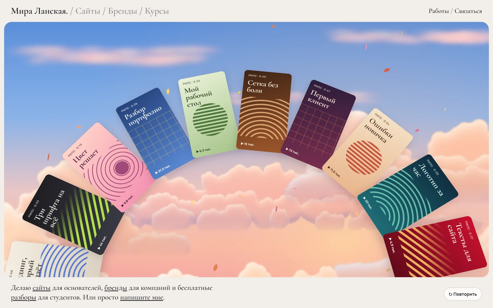
Счётчик 000→100 крутится барабаном, карты по одной ложатся веером, а на 100% веер замыкается в колесо над закатными облаками.
Промпт
Сделай мне прелоадер «Колода раздаётся веером и превращается в колесо» (Сергей Дургалян, MIT). Ниже один HTML-файл: HTML, CSS и чистый JavaScript, без библиотек и картинок. Сначала перенеси его как есть и проверь: на светлом экране слева логотип «Мира.», справа счётчик 000→100 с прокручивающимися цифрами; снизу поднимается колода, карты по одной переворачиваются и ложатся веером; на 100% веер превращается в вращающееся колесо, экран сжимается в окно со скруглёнными углами, в нём закатное небо с облаками и лепестками, появляются шапка и строка про автора. Колесо мыши, свайп и стрелки крутят колесо с инерцией, карточка под курсором выдвигается, кнопка «Повторить» запускает заставку заново. Потом меняй.

Как устроен код:
- Вся заставка — одна шкала времени `T` в миллисекундах: `RISE` (подъём колоды), `COUNT` (бег счётчика), `DEAL0`, `GAP`, `DEAL_D` (раздача: карта `i` стартует в `DEAL0 + i * GAP`), `MORPH0`, `MORPH_D` (веер → колесо). `render(dt)` каждый кадр двигает `T`, поэтому на скрытой вкладке всё просто встаёт на паузу.
- Карточки живут в полярных координатах вокруг одной точки: в колоде угол 0, при раздаче угол растёт до места в веере (`FAN` — половина раскрытия), при превращении угол переходит в равный шаг по кругу, а радиус и центр — к размерам колеса. Переворот — `rotateY` от 180° до 0, у рубашки `.back` и лица `.face` стоит `backface-visibility: hidden`.
- Счётчик — три колонки цифр `.strip`, которые сдвигаются на `-цифра em`. Неровный прогресс задаёт `makeSteps()`: случайные шаги и пара остановок, но 100 всегда наступает ровно в конце `COUNT`.
- Окно — `clip-path: inset(...) round 22px` на `.stage`, отступы берутся из высоты шапки и подвала (`--t`, `--b`). Класс `open` на `body` запускает CSS-переходы окна, неба и шапки.
- Колесо: наклон `TILT`, свой ход `SPIN` градусов в секунду плюс `vel` от колеса мыши, свайпа и стрелок, которая затухает. Наведение плавно выдвигает карточку по радиусу.
- Небо — функция `createSky()`: градиент, облака-спрайты (рисуются один раз в `cloud()`), дрейф и параллакс за курсором, лепестки.
- При `prefers-reduced-motion` сразу показан итог: счётчик 100, колесо на месте, облака и лепестки стоят, колесо поворачивается только по команде без инерции.

Что заменить: тексты карточек в `TITLES` и `VIEWS`, палитры в `PAL` (фон, цвет текста, акцент), число карточек `N`, логотип и подписи в шапке и подвале, шрифты (`Cormorant` для надписей, `JetBrains Mono` для счётчика, оба с кириллицей), длительности фаз (если 6 секунд долго, сожми `COUNT`, `GAP` и `MORPH0`), наклон и скорость колеса, цвета неба в `build()` и облаков в `TONE`. Чтобы на карточках были настоящие обложки рилсов, поставь картинку фоном в `.face` вместо градиента и узора.

Чтобы счётчик показывал реальную загрузку, считай готовые ресурсы (`document.fonts.ready`, `img.decode()`) и передавай процент в `showCount`, а раздачу привяжи к проценту, а не ко времени. Если проект на React: вынеси прелоадер в компонент, карточки строй из массива один раз, позиции обновляй в `requestAnimationFrame` через `ref` и отменяй цикл в очистке `useEffect`. Небо оставь на canvas в отдельном компоненте с тем же `createSky`.
Предложи тексты карточек, палитру и подпись про автора под мой продукт.
Код скопируется вместе с промптом
Заставка начинается со светлого экрана: слева вверху логотип антиквой, справа огромный счётчик процентов, цифры которого прокручиваются, как барабаны механического счётчика. Снизу поднимается колода карточек рубашкой вверх. Пока счётчик неровно бежит к 100, карты по одной слетают с колоды, переворачиваются лицом и ложатся веером, как в руке у игрока. На 100% веер поднимается и замыкается в большое колесо из вертикальных карточек, а экран превращается в «окно» со скруглёнными углами. В окне проявляется закатное небо с объёмными облаками и падающими лепестками, сверху и снизу появляются шапка сайта и строка про автора. Колесо медленно вращается само, колесо мыши, свайп или стрелки раскручивают его с инерцией, а карточка под курсором выдвигается наружу.
Всё сделано на CSS 3D-трансформациях и обычном JS, без three.js, WebGL и картинок. Каждая карточка в формате 9:16 нарисована кодом: градиент, крупная надпись, полосы, круги или сетка, подпись «▶ 12,4 тыс.». Облака — canvas 2D: их один раз рисуют из сотен мягких кругов со светом сверху и сиреневой тенью снизу, а потом только двигают. Подходит для первого экрана портфолио, блога с рилсами, агентства, онлайн-школы, то есть любой страницы, где работ много и их хочется показать сразу. Приём подсмотрен в рилсе @avi_vashishta29 (портфолио на CSS 3D): оттуда взята только механика, код, тексты и графика свои.
Код
<!-- MIT License. Copyright (c) 2026 Sergei Durgalian, learn.create-products.com/design. Free to use, copy and modify with this notice kept. -->
<!DOCTYPE html>
<html lang="ru">
<head>
<meta charset="UTF-8">
<meta name="viewport" content="width=device-width, initial-scale=1">
<title>Deal Deck Wheel</title>
<link rel="stylesheet" href="https://fonts.googleapis.com/css2?family=Cormorant:ital,wght@0,500;0,600;1,500&family=JetBrains+Mono:wght@300&family=Manrope:wght@500;700&display=swap">
<style>
*, *::before, *::after { box-sizing: border-box; }
html, body { margin: 0; height: 100%; }
body { overflow: hidden; background: #f1eee8; color: #1b1a22; font-family: "Manrope", sans-serif; --t: 64px; --b: 86px; }
a { color: inherit; }
a:focus-visible, button:focus-visible, .stage:focus-visible { outline: 2px solid #1b1a22; outline-offset: 3px; }

/* ---------- Site chrome around the "window" (fades in after the preloader) ---------- */
.bar, .about { position: fixed; left: 0; right: 0; display: flex; align-items: center; justify-content: space-between; gap: 16px;
  padding: 0 clamp(16px, 2.4vw, 32px); opacity: 0; transition: opacity .8s .6s; }
.bar { top: 0; height: 64px; }
.bar .logo { font: 600 1.7rem/1 "Cormorant", serif; text-decoration: none; }
.bar .logo span, .bar nav span { color: #8b8794; font-weight: 500; }
.bar nav { font: 500 1.25rem/1 "Cormorant", serif; }
.bar nav a { text-decoration: none; }
.about { bottom: 0; padding-top: 16px; padding-bottom: 18px; padding-right: 140px; }
.about p { margin: 0; max-width: 62ch; font: 500 clamp(1.05rem, 1.6vw, 1.35rem)/1.3 "Cormorant", serif; }
body.open .bar, body.open .about { opacity: 1; }

/* ---------- The window: full screen during the preloader, framed afterwards ---------- */
.stage { position: fixed; inset: 0; overflow: hidden; background: #faf8f4; touch-action: none; cursor: grab;
  clip-path: inset(0 0 0 0 round 0); transition: clip-path 1.25s cubic-bezier(.7, 0, .2, 1); }
body.open .stage { clip-path: inset(var(--t) 12px var(--b) 12px round 22px); }
#sky { position: absolute; inset: 0; width: 100%; height: 100%; display: block; opacity: 0; transition: opacity 1.1s .1s; }
body.open #sky { opacity: 1; }
.scene { position: absolute; inset: 0; perspective: 1600px; }
.wheel { position: absolute; inset: 0; transform-style: preserve-3d; }

/* ---------- Cards: 9:16, drawn with CSS only ---------- */
.card { position: absolute; left: 0; top: 0; width: var(--cw); height: calc(var(--cw) * 16 / 9); transform-style: preserve-3d; will-change: transform; }
.face, .back { position: absolute; inset: 0; border-radius: calc(var(--cw) * .07); overflow: hidden; backface-visibility: hidden; -webkit-backface-visibility: hidden;
  box-shadow: 0 calc(var(--cw) * .06) calc(var(--cw) * .16) rgba(60, 30, 50, .2); }
.face { display: flex; flex-direction: column; padding: 9%; background: var(--bg); color: var(--ink); }
.face::before { content: ""; position: absolute; inset: 34% 0 16%; opacity: .85; }
.face > * { position: relative; }
.cap { font: 700 calc(var(--cw) * .058)/1 "Manrope", sans-serif; letter-spacing: .06em; text-transform: uppercase; opacity: .7; }
.t { margin-top: 8%; font: 600 calc(var(--cw) * .165)/.95 "Cormorant", serif; }
.v { margin-top: auto; font: 700 calc(var(--cw) * .062)/1 "Manrope", sans-serif; }
.p0::before { background: repeating-linear-gradient(-40deg, var(--ac) 0 calc(var(--cw) * .045), transparent 0 calc(var(--cw) * .11)); -webkit-mask: linear-gradient(transparent, #000 60%); mask: linear-gradient(transparent, #000 60%); }
.p1::before { background: radial-gradient(circle at 64% 55%, var(--ac) 0 17%, transparent 17.5%), repeating-radial-gradient(circle at 64% 55%, transparent 0 calc(var(--cw) * .07), var(--ac) 0 calc(var(--cw) * .085)); opacity: .7; }
.p2::before { background: linear-gradient(var(--ac) 1px, transparent 1px) 0 0 / calc(var(--cw) * .16) calc(var(--cw) * .16), linear-gradient(90deg, var(--ac) 1px, transparent 1px) 0 0 / calc(var(--cw) * .16) calc(var(--cw) * .16); opacity: .5; }
.p3::before { inset: auto 14% 22% auto; width: 72%; aspect-ratio: 1; border-radius: 50%; background: repeating-linear-gradient(0deg, var(--ac) 0 calc(var(--cw) * .04), transparent 0 calc(var(--cw) * .075)); }
.p4::before { background: repeating-radial-gradient(circle at 50% 120%, var(--ac) 0 calc(var(--cw) * .03), transparent 0 calc(var(--cw) * .09)); opacity: .75; }
.back { transform: rotateY(180deg); background: #efe6d6; border: calc(var(--cw) * .04) solid #efe6d6;
  background-image: repeating-linear-gradient(45deg, #e2d4bd 0 2px, transparent 0 8px); display: grid; place-items: center; }
.back::after { content: "МЛ"; font: 600 calc(var(--cw) * .3)/1 "Cormorant", serif; color: #7a2e4f; padding: 8% 10%; background: #efe6d6; border-radius: 50%; }

/* ---------- Preloader: logo and the rolling counter ---------- */
.splash { position: fixed; inset: 0; pointer-events: none; z-index: 2; }
.splash > * { position: absolute; transition: opacity .6s, transform .8s cubic-bezier(.7, 0, .2, 1); }
.mark { left: clamp(16px, 2.4vw, 32px); top: 18px; font: 600 clamp(2.2rem, 4vw, 3.6rem)/1 "Cormorant", serif; }
.counter { right: clamp(16px, 2.4vw, 32px); top: 14px; display: flex; font: 300 clamp(3.6rem, 9vw, 8.6rem)/1 "JetBrains Mono", monospace; letter-spacing: -.04em; }
.slot { height: 1em; overflow: hidden; }
.strip { display: flex; flex-direction: column; transition: transform .45s cubic-bezier(.3, 1.35, .5, 1); }
.strip span { height: 1em; }
.counter small { font-size: .16em; letter-spacing: 0; margin: .5em 0 0 .3em; }
.splash.in > * { animation: rise .8s cubic-bezier(.2, .8, .2, 1) backwards; }
@keyframes rise { from { opacity: 0; transform: translateY(30px); } }
body.open .splash > * { opacity: 0; transform: translateY(-40px); }

.again { position: fixed; right: clamp(16px, 2.4vw, 32px); bottom: 22px; z-index: 3; font: 700 .8rem "Manrope", sans-serif; padding: 9px 14px;
  border: 1px solid rgba(27, 26, 34, .2); border-radius: 999px; background: rgba(255, 255, 255, .7); color: inherit; cursor: pointer; }
.again:hover { background: #fff; }
.snap, .snap *, .snap #sky { transition: none; }

@media (max-width: 700px) {
  .bar nav, .bar .logo span { display: none; }
  .about { padding-right: 16px; padding-bottom: 60px; }
}
@media (prefers-reduced-motion: reduce) { .stage, #sky, .bar, .about, .splash > *, .strip { transition: none; } .splash.in > * { animation: none; } }
</style>
</head>
<body>
<header class="bar">
  <a class="logo" href="#">Мира Ланская.<span> / Сайты / Бренды / Курсы</span></a>
  <nav><a href="#">Работы</a> <span>/</span> <a href="#">Связаться</a></nav>
</header>

<main class="stage" id="stage" tabindex="0" aria-label="Колесо работ: крутите колесом мыши, свайпом или стрелками">
  <canvas id="sky" aria-hidden="true"></canvas>
  <div class="scene"><div class="wheel" id="wheel"></div></div>
</main>

<footer class="about">
  <p>Делаю <a href="#">сайты</a> для основателей, <a href="#">бренды</a> для компаний и бесплатные <a href="#">разборы</a> для студентов. Или просто <a href="#">напишите мне</a>.</p>
</footer>

<div class="splash" id="splash" role="progressbar" aria-label="Загрузка" aria-valuemin="0" aria-valuemax="100" aria-valuenow="0">
  <div class="mark">Мира.</div>
  <div class="counter" id="counter" aria-hidden="true"></div>
</div>
<button class="again" id="again" type="button">↻ Повторить</button>

<script>
// Deal Deck Wheel preloader. Timeline (ms): the deck rises, the counter rolls 000 -> 100 with uneven steps,
// cards are dealt one by one (flip face up + fan out), at 100% the fan turns into a slowly spinning wheel
// and the sunset sky shows through the framed "window". All cards live in polar coordinates around one
// pivot: deal = angle 0 -> fan angle, wheel = fan angle -> evenly spaced angle with a bigger radius.
const reduce = matchMedia('(prefers-reduced-motion: reduce)').matches;
const $ = (id) => document.getElementById(id);
const stage = $('stage'), wheel = $('wheel'), counter = $('counter'), splash = $('splash');

const N = 20;                                    // cards in the deck
const RISE = [200, 1100], COUNT = [900, 4600];   // deck rise, counter run
const DEAL0 = 1300, GAP = 140, DEAL_D = 560;     // card i starts its deal at DEAL0 + i * GAP
const MORPH0 = 4750, MORPH_D = 1500;             // fan -> wheel
const FAN = 62, TILT = 18, SPIN = 5;             // fan half-angle, wheel tilt, idle spin (deg/s)

const PAL = [ // background, ink, accent
  ['linear-gradient(160deg,#2b1d3a,#7a2e4f)', '#ffe9d6', '#ff8a5b'], ['linear-gradient(160deg,#f4e3c9,#e9b48a)', '#3a1f14', '#c2452d'],
  ['linear-gradient(170deg,#0f2b3d,#1f6f78)', '#e8fff8', '#7ee0c3'], ['linear-gradient(160deg,#c8102e,#5c0a1a)', '#fff2e6', '#ffcf6b'],
  ['linear-gradient(165deg,#f6efe4,#d9d0c0)', '#1b1b1b', '#2f5bd3'], ['linear-gradient(160deg,#1b1b1f,#3b3b45)', '#f3f0ea', '#c6ff4a'],
  ['linear-gradient(160deg,#ffd6c9,#f48fb1)', '#3b1030', '#7a1f5c'], ['linear-gradient(165deg,#25417a,#5b8bd6)', '#fff8ec', '#ffd166'],
  ['linear-gradient(160deg,#e9f1d8,#a7c48a)', '#1f2d16', '#3d6b2b'], ['linear-gradient(160deg,#3d2416,#a0582c)', '#fff1e2', '#ffc38a'],
];
const TITLES = ['Сайт за выходные', 'Бренд с нуля', 'Как найти свой стиль', 'Курс за 30 дней', 'Лендинг, который продаёт',
  'Три шрифта на всё', 'Цвет решает', 'Разбор портфолио', 'Мой рабочий стол', 'Сетка без боли', 'Первый клиент', 'Ошибки новичка',
  'Логотип за час', 'Тексты для сайта', 'Анимация без кода', 'Фото для бренда', 'Как я беру заказы', 'Фигма за вечер', 'Цены на дизайн', 'Сайт для кофейни'];
const VIEWS = ['12,4', '8,1', '31', '5,7', '19,2', '44', '9,8', '27,5', '6,3', '15', '72', '11,6', '23', '4,9', '38', '13,1', '7,4', '56', '21,8', '10,2'];

const cards = TITLES.slice(0, N).map((title, i) => {
  const [bg, ink, ac] = PAL[i % PAL.length];
  const el = document.createElement('div'); el.className = 'card';
  el.innerHTML = `<div class="face p${(i + (i >= 10 ? 2 : 0)) % 5}"><span class="cap">Рилс · 0:${String(18 + (i * 7) % 41).padStart(2, '0')}</span>`
    + `<b class="t">${title}</b><span class="v">▶ ${VIEWS[i]} тыс.</span></div><div class="back"></div>`;
  const face = el.firstChild; face.style.setProperty('--bg', bg); face.style.setProperty('--ink', ink); face.style.setProperty('--ac', ac);
  wheel.append(el);
  const c = { el, jit: (Math.random() - .5) * 5, hv: 0 };
  el.addEventListener('pointerenter', () => (hover = i));
  el.addEventListener('pointerleave', () => { if (hover === i) hover = -1; });
  return c;
});

// counter: three rolling strips (hundreds only need 0 and 1)
const strips = [2, 10, 10].map((n) => {
  const slot = document.createElement('div'); slot.className = 'slot';
  const strip = document.createElement('div'); strip.className = 'strip';
  for (let d = 0; d < n; d++) strip.insertAdjacentHTML('beforeend', `<span>${d}</span>`);
  slot.append(strip); counter.append(slot); return strip;
});
counter.insertAdjacentHTML('beforeend', '<small>%</small>');
let shown = -1;
function showCount(v) {
  if (v === shown) return; shown = v;
  String(v).padStart(3, '0').split('').forEach((d, i) => (strips[i].style.transform = `translateY(${-d}em)`));
  splash.setAttribute('aria-valuenow', v);
}

// uneven fake progress: random chunks + a couple of stalls, always finishing exactly at COUNT[1]
let steps = [];
function makeSteps() {
  const vals = []; let v = 0;
  while (v < 100) vals.push(v = Math.min(100, v + 1 + (Math.random() * 9 | 0)));
  const w = vals.map(() => .4 + Math.random());
  for (let k = 0; k < 2; k++) w[1 + (Math.random() * (w.length - 2) | 0)] += 3;
  const sum = w.reduce((a, b) => a + b, 0); let t = COUNT[0];
  steps = vals.map((val, i) => ({ t: (t += w[i] / sum * (COUNT[1] - COUNT[0])), val }));
}

const clamp = (x) => Math.max(0, Math.min(1, x));
const lerp = (a, b, k) => a + (b - a) * k;
const out3 = (x) => 1 - (1 - x) ** 3, inOut = (x) => (x < .5 ? 4 * x * x * x : 1 - (-2 * x + 2) ** 3 / 2);
const RAD = Math.PI / 180;
const outBack = (x) => 1 + 2.2 * (x - 1) ** 3 + 1.2 * (x - 1) ** 2;

let W, H, cw, ch, R, cyW, fanR, fanCy, fan;
function layout() {
  W = innerWidth; H = innerHeight;
  const t = document.querySelector('.bar').offsetHeight, b = document.querySelector('.about').offsetHeight;
  document.body.style.setProperty('--t', t + 'px'); document.body.style.setProperty('--b', b + 'px');
  const vh = H - t - b;
  const tall = vh > W;                                         // phones: the arch sits lower and bigger
  R = Math.min(Math.max(W * .4, tall ? vh * .45 : 0, 250), vh * 1.1); // wheel radius
  cw = Math.min(R * .28, vh * .21, W * .22, 160); ch = cw * 16 / 9;
  cyW = t + vh * (tall ? .2 : .1) + ch / 2 + R;                         // wheel centre sits below the window
  fanR = ch * 1.2; fanCy = H * .6 + fanR;                   // deck / fan pivot
  fan = Math.min(FAN, Math.asin(Math.min(1, (W / 2 - cw) / fanR)) / RAD); // narrow screens: a tighter fan
  wheel.style.setProperty('--cw', cw + 'px');
  wheel.style.transformOrigin = `${W / 2}px ${cyW}px`;
}

let T = 0, last = 0, rot = 0, vel = 0, hover = -1, opened = false, raf = 0;
function open(on) { opened = on; document.body.classList.toggle('open', on); }

function render(dt) {
  T += dt;
  if (T >= COUNT[0]) { let v = 0; for (const s of steps) if (s.t <= T) v = s.val; showCount(v); }
  const rise = out3(clamp((T - RISE[0]) / (RISE[1] - RISE[0])));
  const mk = inOut(clamp((T - MORPH0) / MORPH_D));
  if (T >= MORPH0 && !opened) open(true);
  if (T >= MORPH0) { rot += (reduce ? 0 : SPIN + vel) * dt / 1000; vel *= Math.exp(-dt / 1000 * 2.2); }
  wheel.style.transform = `rotateX(${TILT * mk}deg)`;
  const pivot = lerp(fanCy, cyW, mk), rad = lerp(fanR, R, mk);
  cards.forEach((c, i) => {
    const u = outBack(clamp((T - DEAL0 - i * GAP) / DEAL_D)), uu = Math.min(1, u);
    const fanA = (i / (N - 1) - .5) * 2 * fan, wheelA = (i - (N - 1) / 2) * 360 / N + rot;
    c.hv += ((mk === 1 && hover === i ? 1 : 0) - c.hv) * Math.min(1, dt / 90);
    const a = lerp(lerp(c.jit, fanA, u), wheelA, mk);
    const r = rad + c.hv * cw * .3;
    const z = lerp(lerp((N - i) * 1.5, i * 1.5, uu), 0, mk) + Math.sin(Math.PI * uu) * 70 * (1 - mk) + c.hv * 60;
    const x = W / 2 + r * Math.sin(a * RAD) - cw / 2;
    const y = pivot - r * Math.cos(a * RAD) + (1 - rise) * (H * .75 + i * 6) - ch / 2;
    c.el.style.transform = `translate3d(${x}px,${y}px,${z}px) rotateZ(${a}deg) rotateY(${180 * (1 - uu)}deg)`;
  });
}

function loop(now) { render(Math.min(50, now - last)); last = now; raf = requestAnimationFrame(loop); }
function start() { if (!raf && !reduce && !document.hidden) { last = performance.now(); raf = requestAnimationFrame(loop); } }
function stop() { cancelAnimationFrame(raf); raf = 0; }
document.addEventListener('visibilitychange', () => (document.hidden ? stop() : start()));   // timeline pauses with the tab

function play() {
  document.body.classList.add('snap'); open(false); T = 0; rot = 0; vel = 0; shown = -1; makeSteps(); showCount(0);
  splash.classList.remove('in'); void splash.offsetWidth; splash.classList.add('in');
  void document.body.offsetWidth; document.body.classList.remove('snap');
  if (reduce) { T = MORPH0 + MORPH_D; showCount(100); render(0); } else render(0);
}

// input: wheel / swipe / arrows spin the wheel with inertia (in reduced motion: step without inertia)
const nudge = (deg) => { if (!opened) return; if (reduce) { rot += deg; render(0); } else vel += deg * 3; };
addEventListener('wheel', (e) => nudge(Math.max(-40, Math.min(40, (e.deltaY || e.deltaX) * .15))), { passive: true });
let drag = null;
stage.addEventListener('pointerdown', (e) => { drag = { x: e.clientX, t: performance.now() }; stage.setPointerCapture(e.pointerId); });
stage.addEventListener('pointermove', (e) => {
  if (!drag || !opened) return;
  const now = performance.now(), dx = e.clientX - drag.x, deg = dx * .12;
  rot += deg; if (!reduce) vel = lerp(vel, deg / Math.max(8, now - drag.t) * 1000 - SPIN, .5); else render(0);
  drag = { x: e.clientX, t: now };
});
addEventListener('pointerup', () => (drag = null));
stage.addEventListener('keydown', (e) => {
  if (e.key === 'ArrowRight' || e.key === 'ArrowDown') { nudge(12); e.preventDefault(); }
  if (e.key === 'ArrowLeft' || e.key === 'ArrowUp') { nudge(-12); e.preventDefault(); }
});
$('again').addEventListener('click', play);
let rt; addEventListener('resize', () => { clearTimeout(rt); rt = setTimeout(() => { layout(); render(0); }, 120); });

function createSky(cv, opt = {}) {
  const ctx = cv.getContext('2d');
  const PETAL_COLORS = ['#ff6b4a', '#ffb347', '#ffd166', '#f78fb3', '#e8505b', '#ff9f68'];
  // cloud tones: light top, body, lobe rim, bottom shade (rgb)
  const TONE = {
    near: [[255, 249, 240], [255, 217, 190], [242, 160, 160], [150, 112, 170]],
    mid:  [[255, 240, 226], [252, 200, 180], [236, 150, 162], [140, 112, 176]],
    far:  [[255, 228, 220], [246, 186, 184], [226, 150, 176], [128, 120, 190]],
  };
  // layout: kind, centre x (of width), bottom y (of height), width, height (of cloud unit), depth, tone
  const LAYOUT = [
    ['wisp', .22, .24, .55, .12, .15, 'far'], ['wisp', .82, .17, .5, .1, .15, 'far'], ['wisp', .56, .36, .45, .08, .2, 'far'],
    ['cloud', .5, .8, 1.15, .3, .25, 'far'],
    ['cloud', .12, .9, .55, .42, .5, 'mid'], ['cloud', .8, .74, .52, .46, .5, 'mid'],
    ['cloud', .95, 1.06, .72, .64, 1, 'near'], ['cloud', .04, 1.1, .6, .48, 1, 'near'], ['cloud', .5, 1.16, .72, .36, 1, 'near'],
  ];
  let W = 0, H = 0, D = 1, sprites = [], petals = [], grad, sun, raf = 0, last = 0;
  let px = 0, py = 0, tx = 0, ty = 0;

  // small seeded random, so the sky looks the same on every load
  const rng = (a) => () => { a = a + 0x6d2b79f5 | 0; let t = Math.imul(a ^ a >>> 15, 1 | a); t = t + Math.imul(t ^ t >>> 7, 61 | t) ^ t; return ((t ^ t >>> 14) >>> 0) / 4294967296; };
  const rgba = (c, a) => `rgba(${c[0]},${c[1]},${c[2]},${a})`;

  const mk = (w, h) => { const c = document.createElement('canvas'); c.width = w; c.height = h; return c; };
  // paint `mask` in `color` minus the same mask shifted by dx/dy: the light (or shadow) rim of every lobe
  function rimLayer(g, mask, color, dx, dy, soft, alpha) {
    const t = mk(mask.width, mask.height), tg = t.getContext('2d');
    tg.drawImage(mask, 0, 0); tg.globalCompositeOperation = 'source-in'; tg.fillStyle = color; tg.fillRect(0, 0, t.width, t.height);
    if (dx || dy) { tg.globalCompositeOperation = 'destination-out'; tg.filter = `blur(${soft}px)`; tg.drawImage(mask, dx, dy); }
    g.globalAlpha = alpha; g.drawImage(t, 0, 0); g.globalAlpha = 1;
  }

  function cloud(w, h, tone, r) {
    const c = mk(w, h), g = c.getContext('2d'), [hi, body, rim, shade] = TONE[tone].map((v) => rgba(v, 1));
    // silhouette = a few gaussian "towers" over a low base
    const towers = Array.from({ length: 4 + (r() * 4 | 0) }, () => ({ x: .2 + r() * .6, w: .06 + r() * .13, h: .35 + r() * .65 }));
    const top = (u) => { let v = .2 * Math.exp(-(((u - .5) / .38) ** 2)); for (const t of towers) v = Math.max(v, t.h * Math.exp(-(((u - t.x) / t.w) ** 2))); return v; };
    const base = h * .8, pad = h * .05, puffs = [];
    const count = Math.round(150 * Math.min(1.8, w / h / 1.5));
    for (let k = 0; k < count; k++) {
      const u = .05 + r() * .9, t = top(u);
      if (t < .07) continue;
      const edge = base - t * (base - pad);                       // top of the cloud at this x
      const rad = h * (.05 + .09 * Math.sqrt(t)) * (.6 + r() * .6);
      const y = Math.min(base - rad * .4, edge + rad * .9 + r() * Math.max(0, base - edge - rad * 1.3));
      puffs.push({ x: u * w, y, r: rad });
    }
    puffs.sort((a, b) => a.y - b.y);
    // three depth bands, back (upper) to front (lower): front lobes overlap the back ones,
    // and the rim light of each band draws the inner "cauliflower" edges
    const bands = [[], [], []];
    puffs.forEach((p, i) => bands[Math.min(2, (i * 3 / puffs.length) | 0)].push(p));
    const soft = Math.max(1, h / 150);
    for (const band of bands) {
      if (!band.length) continue;
      const m = mk(w, h), mg = m.getContext('2d'), R = band.reduce((s, p) => s + p.r, 0) / band.length;
      mg.filter = `blur(${soft}px)`; mg.fillStyle = '#fff';
      for (const p of band) {
        mg.beginPath(); mg.arc(p.x, p.y, p.r, 0, 7); mg.fill();
        for (let j = 0; j < 3; j++) {                              // fluff on the upper edge of each puff
          const a = -Math.PI * (.1 + r() * .8), rr = p.r * (.25 + r() * .2);
          mg.beginPath(); mg.arc(p.x + Math.cos(a) * p.r * .85, p.y + Math.sin(a) * p.r * .85, rr, 0, 7); mg.fill();
        }
      }
      rimLayer(g, m, body, 0, 0, 0, 1);
      rimLayer(g, m, shade, -R * .06, -R * .4, R * .25, .6);     // underside of the lobes
      rimLayer(g, m, rim, R * .04, R * .12, R * .12, .35);         // warm edge
      rimLayer(g, m, hi, R * .12, R * .38, R * .3, .95);           // sunlit tops
      rimLayer(g, m, 'rgba(255,253,244,1)', R * .05, R * .14, R * .1, .7); // crisp rim
    }
    g.globalCompositeOperation = 'source-atop';                   // overall light only where the cloud is
    let lg = g.createLinearGradient(0, pad, 0, base);
    lg.addColorStop(0, 'rgba(255,252,240,.35)'); lg.addColorStop(.5, 'rgba(255,240,225,0)'); lg.addColorStop(1, rgba(TONE[tone][3], .35));
    g.fillStyle = lg; g.fillRect(0, 0, w, h);
    const rg = g.createRadialGradient(w * .7, base, 0, w * .7, base, w * .55);   // warm sunset light from below
    rg.addColorStop(0, 'rgba(255,170,110,.35)'); rg.addColorStop(1, 'rgba(255,170,110,0)');
    g.fillStyle = rg; g.fillRect(0, 0, w, h);
    g.globalCompositeOperation = 'destination-in';                // soft flat bottom
    lg = g.createLinearGradient(0, base - h * .1, 0, base + h * .04);
    lg.addColorStop(0, '#000'); lg.addColorStop(1, 'rgba(0,0,0,0)');
    g.fillStyle = lg; g.fillRect(0, 0, w, h);
    return c;
  }

  function wisp(w, h, r) {
    const c = mk(w, h), g = c.getContext('2d');
    g.filter = 'blur(' + Math.max(2, h / 14) + 'px)';
    for (let k = 0; k < 46; k++) {
      const ry = h * (.07 + r() * .1), sx = Math.min(3 + r() * 6, w * .12 / ry);
      const x = w * (.18 + r() * .64), y = h * (.5 + (r() - .5) * .35);
      g.save(); g.translate(x, y); g.scale(sx, 1);
      const gr = g.createRadialGradient(0, -ry * .3, 0, 0, 0, ry);
      gr.addColorStop(0, `rgba(255,${222 + (r() * 20 | 0)},${214 + (r() * 20 | 0)},${.35 + r() * .3})`); gr.addColorStop(1, 'rgba(246,170,180,0)');
      g.fillStyle = gr; g.beginPath(); g.arc(0, 0, ry, 0, 7); g.fill(); g.restore();
    }
    return c;
  }

  function build() {
    const r = rng(opt.seed || 7);
    const cw = Math.max(W, H * .9), ch = Math.min(H, cw * .62);   // cloud unit keeps proportions on tall phones
    const q = Math.min(D, 1.25);                                  // sprites are soft: no need for full DPR
    sprites = LAYOUT.map(([kind, x, y, w, h, d, tone]) => {
      const sw = w * cw, sh = h * ch;
      const c = kind === 'wisp' ? wisp(sw * q | 0, sh * q | 0, r) : cloud(sw * q | 0, sh * q | 0, tone, r);
      return { c, x: x * W, y: y * H, w: sw, h: sh, d, v: (3 + d * 6) * (r() < .5 ? 1 : .7) };
    });
    grad = ctx.createLinearGradient(0, 0, 0, H);
    grad.addColorStop(0, '#4f86d6'); grad.addColorStop(.38, '#8ab3e8'); grad.addColorStop(.62, '#e9c6c6');
    grad.addColorStop(.8, '#f7b9a4'); grad.addColorStop(1, '#f093a0');
    sun = ctx.createRadialGradient(W * .7, H * .78, 0, W * .7, H * .78, Math.max(W, H) * .6);
    sun.addColorStop(0, 'rgba(255,214,160,.75)'); sun.addColorStop(.4, 'rgba(255,190,160,.25)'); sun.addColorStop(1, 'rgba(255,190,160,0)');
    const n = Math.round(Math.min(64, Math.max(18, W * H / 26000)) * (opt.petals ?? 1));
    petals = Array.from({ length: n }, () => ({
      x: Math.random() * W, y: Math.random() * H, s: 4 + Math.random() * 6, d: .4 + Math.random() * .6,
      vy: 16 + Math.random() * 34, sw: 12 + Math.random() * 30, ph: Math.random() * 6.3, fr: .6 + Math.random() * 1.2,
      rot: Math.random() * 6.3, vr: (Math.random() - .5) * 3, fl: Math.random() * 6.3, vf: 2 + Math.random() * 4,
      col: PETAL_COLORS[(Math.random() * PETAL_COLORS.length) | 0],
    }));
  }

  function resize() {
    const box = cv.getBoundingClientRect();
    W = Math.max(1, box.width); H = Math.max(1, box.height); D = Math.min(devicePixelRatio || 1, 1.5);
    cv.width = W * D | 0; cv.height = H * D | 0;
    build(); draw(0, 0);
  }

  function draw(dt, t) {
    px += (tx - px) * Math.min(1, dt * 3); py += (ty - py) * Math.min(1, dt * 3);
    ctx.setTransform(D, 0, 0, D, 0, 0);
    ctx.fillStyle = grad; ctx.fillRect(0, 0, W, H);
    ctx.fillStyle = sun; ctx.fillRect(0, 0, W, H);
    for (const s of sprites) {
      s.x += s.v * dt;
      if (s.x - s.w / 2 > W) s.x -= W + s.w;                    // wrap around when it drifts away
      ctx.drawImage(s.c, s.x - s.w / 2 - px * s.d * 36, s.y - s.h - py * s.d * 18, s.w, s.h);
    }
    for (const p of petals) {
      p.y += p.vy * dt * p.d; p.x += (Math.sin(t * p.fr + p.ph) * p.sw + 8) * dt * p.d;
      p.rot += p.vr * dt; p.fl += p.vf * dt;
      if (p.y > H + 12) { p.y = -12; p.x = Math.random() * W; }
      if (p.x > W + 12) p.x = -12;
      const f = Math.cos(p.fl);
      ctx.setTransform(D, 0, 0, D, (p.x - px * p.d * 50) * D, (p.y - py * p.d * 25) * D);
      ctx.rotate(p.rot); ctx.scale(1, Math.abs(f) < .12 ? .12 : f);
      ctx.globalAlpha = .55 + p.d * .45;
      ctx.fillStyle = p.col; ctx.beginPath(); ctx.ellipse(0, 0, p.s * p.d * 1.3, p.s * p.d * .7, 0, 0, 7); ctx.fill();
      if (f < 0) { ctx.fillStyle = 'rgba(120,40,40,.25)'; ctx.fill(); }   // darker back side of the petal
      ctx.globalAlpha = 1;
    }
  }

  function loop(now) {
    const dt = Math.min(.05, (now - last) / 1000 || 0); last = now;
    draw(dt, now / 1000);
    raf = requestAnimationFrame(loop);
  }
  function start() { if (!raf && !opt.reduce && !document.hidden) { last = performance.now(); raf = requestAnimationFrame(loop); } }
  function stop() { cancelAnimationFrame(raf); raf = 0; }

  addEventListener('pointermove', (e) => { tx = e.clientX / innerWidth - .5; ty = e.clientY / innerHeight - .5; }, { passive: true });
  document.addEventListener('visibilitychange', () => (document.hidden ? stop() : start()));   // pause on a hidden tab
  let rt; addEventListener('resize', () => { clearTimeout(rt); rt = setTimeout(resize, 120); });
  resize(); start();
  return { resize, start, stop };
}

createSky($('sky'), { reduce, petals: .8 });
layout(); play(); start();
</script>
</body>
</html>