Эффекты и шейдерыСветлыйМинимализмТипографикаБесплатно
Курсор-кольцо, которое вскипает и раздувается над ссылкой
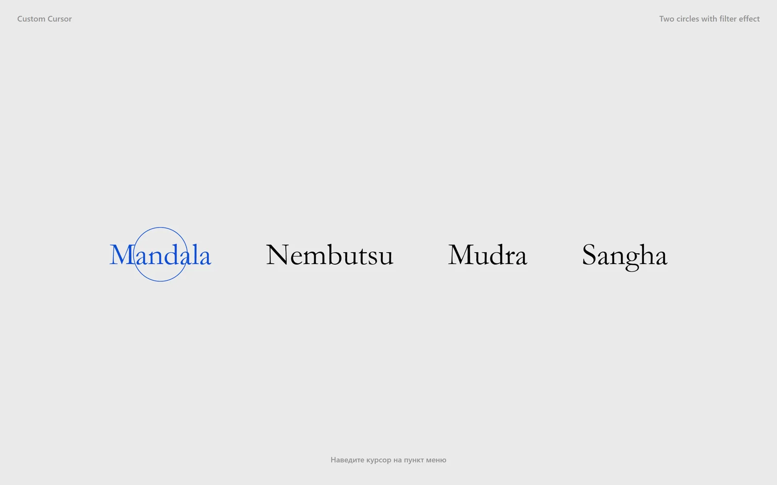
Два тонких кольца плывут за курсором, над ссылкой раздуваются, на миг «вскипают» шумом SVG-фильтра и снова становятся ровными.
Промпт
Добавь в мой проект эффект «Курсор-кольцо, которое вскипает и раздувается над ссылкой» (Codrops Sketch 013: Custom Cursor (two circles with filter effect), лицензия MIT). Ниже HTML, CSS и JavaScript одним файлом на GSAP 3.13.0 с jsdelivr. Сначала перенеси как есть и проверь: за курсором плывут два кольца с разной инерцией, над ссылкой оба раздуваются с 20 до 50 px радиуса, контур на секунду идёт рваной волной и выравнивается.

Как устроен код. В конце `body` лежат два `<svg class="cursor">` 120×120 с `<circle class="cursor__inner" r="20">` (обводка 1px цвета `--cursor-stroke`, без заливки), `position: fixed`, `pointer-events: none`. В первом SVG объявлен фильтр `#cursor-filter`: `feTurbulence type="fractalNoise"` и `feDisplacementMap scale="30"`. Класс `CursorElement` хранит пары «предыдущее/текущее» для `tx`, `ty` и `radius` и на каждом кадре `gsap.ticker` подтягивает предыдущее к текущему через `lerp(a, b, amt)`; у первого кольца `amt` 0.15, у второго 0.1 (атрибут `data-amt`). Наведение определяется проверкой `document.elementFromPoint` в точке курсора и `closest('a')`, поэтому виртуальный курсор автодемо и настоящая мышь работают одинаково. При входе на ссылку радиус целится в `RADIUS_ON_ENTER`, а таймлайн GSAP включает окружностям `filter: url(#cursor-filter)` и за 1 с (`ease: expo`) уводит `baseFrequency` шума с 0.35 до 0, после чего снимает фильтр.

Что менять: цвет колец (`--cursor-stroke`) и подсветки ссылки (`--color-link-hover`), размер в покое (`r="20"`) и над ссылкой (`RADIUS_ON_ENTER`, не больше 55, иначе кольцо упрётся в край SVG 120×120), инерцию (`data-amt`: меньше — ленивее), силу «кипения» (`scale` у `feDisplacementMap` и стартовое 0.35), длительность (1 с), какие элементы раздувают курсор (`TRIGGER`, например `'a, button'`). Можно оставить одно кольцо или добавить третье с `data-amt="0.06"`. Пункты меню и шрифт (Goudy Old Style / Garamond / Times) замени на свои.

Если проект на React: вынеси курсор в компонент `<CustomCursor />`, который рендерит оба SVG в портале в `body`, состояние колец держи в `useRef` (не в state: обновление 60 раз в секунду не должно перерисовывать React), цикл подключай `gsap.ticker.add` в `useEffect` и снимай `gsap.ticker.remove` при размонтировании вместе с обработчиками `pointermove`/`pointerdown`. Не убирай `pointer-events: none` у `.cursor` (иначе `elementFromPoint` найдёт сам курсор) и запас фильтра `x="-50%" width="200%"` (иначе волна обрежется квадратом). При `prefers-reduced-motion` кольца не отстают, не «кипят», автодемо выключено, оставь эту ветку.
Покажи, где на моём сайте такой курсор будет к месту, и подставь мои пункты меню.
Код скопируется вместе с промптом
Светло-серая страница с меню из четырёх слов антиквой. За курсором плывут два тонких синих кольца: одно держится близко, второе догоняет с ленцой, и при движении они расходятся восьмёркой. Наводишь на пункт меню, и оба кольца раздуваются, а их контур на секунду «вскипает» рваной волной и успокаивается в ровную окружность. Уводишь, и кольца сжимаются обратно.
Курсор — два SVG 120×120 с окружностью, которые на каждом кадре догоняют указатель линейной интерполяцией (у каждого свой коэффициент, отсюда восьмёрка). «Кипение» даёт SVG-фильтр: feTurbulence генерирует шум, feDisplacementMap сдвигает им пиксели окружности, а GSAP за секунду опускает частоту шума с 0.35 до 0. Без WebGL, весь эффект — 120 строк. Подходит для меню студии, портфолио, лендинга в духе журнала. Пока мышь не двигалась, виртуальный курсор сам обходит пункты меню, на телефоне кольцо прыгает к пальцу.
Код
<!DOCTYPE html>
<html lang="ru">
<head>
<meta charset="UTF-8">
<meta name="viewport" content="width=device-width, initial-scale=1">
<title>Custom cursor with filter effect</title>
<link rel="icon" href="data:,">
<style>
  *, *::before, *::after { box-sizing: border-box; }
  html, body { height: 100%; margin: 0; }
  body {
    --color-text: #919191;
    --color-bg: #eaeaea;
    --color-link: #000;
    --color-link-hover: #104ed6;
    --cursor-stroke: #104ed6;
    background: var(--color-bg); color: var(--color-text);
    font-family: -apple-system, BlinkMacSystemFont, "Segoe UI", Helvetica, Arial, sans-serif; font-weight: 500;
    -webkit-font-smoothing: antialiased; overflow: hidden;
  }
  main { height: 100vh; display: flex; flex-direction: column; }
  .frame { padding: 1.5rem 2rem 0; font-size: 15px; display: flex; justify-content: space-between; gap: 1rem; }
  .menu {
    flex: 1; display: grid; place-items: center; align-content: center; justify-content: center;
    gap: 7vw; font-size: 2rem; touch-action: manipulation;
    font-family: "Goudy Old Style", Garamond, "Big Caslon", "Times New Roman", serif;
  }
  .menu__item { color: var(--color-link); text-decoration: none; transition: color 0.3s; -webkit-tap-highlight-color: transparent; }
  .menu__item:hover, .menu__item.is-hover { color: var(--color-link-hover); }
  .menu__item:focus-visible { outline: 2px solid var(--color-link-hover); outline-offset: 6px; }
  .hint { position: fixed; left: 0; right: 0; bottom: 1.5rem; text-align: center; font-size: 14px; }
  /* the cursor: two 120x120 SVGs that follow the pointer, the native cursor stays */
  .cursor { position: fixed; top: 0; left: 0; pointer-events: none; z-index: 10000; opacity: 0; }
  .cursor__inner { fill: none; stroke: var(--cursor-stroke); stroke-width: 1px; }
  @media (min-width: 53em) {
    .menu { font-size: 4vw; grid-auto-flow: column; }
  }
</style>
</head>
<body>
  <main>
    <div class="frame"><span>Custom Cursor</span><span>Two circles with filter effect</span></div>
    <nav class="menu" aria-label="Меню">
      <a class="menu__item" href="#">Mandala</a>
      <a class="menu__item" href="#">Nembutsu</a>
      <a class="menu__item" href="#">Mudra</a>
      <a class="menu__item" href="#">Sangha</a>
    </nav>
    <p class="hint">Наведите курсор на пункт меню</p>
  </main>

  <svg class="cursor" width="120" height="120" viewBox="0 0 120 120" aria-hidden="true">
    <defs>
      <!-- noise that warps the circle; baseFrequency is animated from 0.35 to 0 on hover -->
      <filter id="cursor-filter" x="-50%" y="-50%" width="200%" height="200%" filterUnits="objectBoundingBox">
        <feTurbulence type="fractalNoise" baseFrequency="0" numOctaves="1" result="warp" />
        <feDisplacementMap xChannelSelector="R" yChannelSelector="G" scale="30" in="SourceGraphic" in2="warp" />
      </filter>
    </defs>
    <circle class="cursor__inner" cx="60" cy="60" r="20" />
  </svg>
  <svg class="cursor" width="120" height="120" viewBox="0 0 120 120" data-amt="0.1" aria-hidden="true">
    <circle class="cursor__inner" cx="60" cy="60" r="20" />
  </svg>

  <script src="https://cdn.jsdelivr.net/npm/gsap@3.13.0/dist/gsap.min.js"></script>
  <script>
    // Based on Codrops Sketch 013: Custom Cursor (two circles with filter effect)
    // https://github.com/codrops/codrops-sketches — MIT License, Copyright (c) 2022 Codrops
    const reduceMotion = window.matchMedia('(prefers-reduced-motion: reduce)').matches;
    const lerp = (a, b, n) => (1 - n) * a + n * b;
    const SIZE = 120;            // SVG size, the circle sits in its centre
    const RADIUS_ON_ENTER = 50;  // circle radius over a link
    const TRIGGER = 'a';         // elements that blow the cursor up

    const pointer = { x: innerWidth / 2, y: innerHeight / 2 };
    const turbulence = document.querySelector('#cursor-filter feTurbulence');
    const noise = { value: 0 };

    class CursorElement {
      constructor(el) {
        this.el = el;
        this.inner = el.querySelector('.cursor__inner');
        this.radius = Number(this.inner.getAttribute('r'));
        const amt = reduceMotion ? 1 : Number(el.dataset.amt || 0.15); // lower = lazier follow
        this.s = {
          tx: { prev: 0, cur: 0, amt }, ty: { prev: 0, cur: 0, amt },
          radius: { prev: this.radius, cur: this.radius, amt },
        };
      }
      show() {
        this.s.tx.prev = pointer.x - SIZE / 2;
        this.s.ty.prev = pointer.y - SIZE / 2;
        this.el.style.opacity = 1;
      }
      enter() { this.s.radius.cur = RADIUS_ON_ENTER; }
      leave() { this.s.radius.cur = this.radius; }
      render() {
        this.s.tx.cur = pointer.x - SIZE / 2;
        this.s.ty.cur = pointer.y - SIZE / 2;
        for (const k in this.s) this.s[k].prev = lerp(this.s[k].prev, this.s[k].cur, this.s[k].amt);
        this.el.style.transform = `translate(${this.s.tx.prev}px, ${this.s.ty.prev}px)`;
        this.inner.setAttribute('r', this.s.radius.prev);
      }
    }

    const cursors = [...document.querySelectorAll('.cursor')].map(el => new CursorElement(el));
    const inners = cursors.map(c => c.inner);

    // On enter the noise jumps to 0.35 and calms down to 0 in a second: the ring "boils" and settles
    const filterTl = gsap.timeline({
      paused: true,
      onStart: () => inners.forEach(i => (i.style.filter = 'url(#cursor-filter)')),
      onUpdate: () => turbulence.setAttribute('baseFrequency', noise.value),
      onComplete: () => inners.forEach(i => (i.style.filter = 'none')),
    }).to(noise, { duration: 1, ease: 'expo', startAt: { value: 0.35 }, value: 0 });

    // Hover is found by hit-testing the cursor point, so the virtual demo cursor works the same way
    let hovered = null;
    const setHovered = link => {
      if (link === hovered) return;
      if (hovered) hovered.classList.remove('is-hover');
      hovered = link;
      if (link) {
        link.classList.add('is-hover');
        cursors.forEach(c => c.enter());
        if (!reduceMotion) filterTl.restart();
      } else {
        cursors.forEach(c => c.leave());
        filterTl.progress(1).pause();
      }
    };

    let started = false;
    const start = () => {
      if (started) return;
      started = true;
      cursors.forEach(c => c.show());
      gsap.ticker.add(() => {
        const hit = document.elementFromPoint(pointer.x, pointer.y);
        setHovered(hit ? hit.closest(TRIGGER) : null);
        cursors.forEach(c => c.render());
      });
    };

    // Autodemo: a virtual cursor walks over the menu items until the visitor moves the mouse or taps
    let demo = null;
    if (!reduceMotion) {
      const links = [...document.querySelectorAll('.menu__item')];
      const centre = el => { const r = el.getBoundingClientRect(); return { x: r.left + r.width / 2, y: r.top + r.height / 2 }; };
      const off = el => { const c = centre(el); return { x: c.x, y: c.y + Math.min(innerHeight * 0.18, 140) }; };
      const build = () => {
        Object.assign(pointer, off(links[0]));
        const tl = gsap.timeline({ repeat: -1, delay: 0.2 });
        links.forEach((link, i) => {
          tl.to(pointer, { ...centre(link), duration: 0.55, ease: 'power2.inOut' })
            .to({}, { duration: 1.3 })
            .to(pointer, { ...off(links[(i + 1) % links.length]), duration: 0.5, ease: 'power2.inOut' });
        });
        return tl;
      };
      start();
      demo = build();
    }
    const stopDemo = () => { if (demo) { demo.kill(); demo = null; } };

    const follow = e => { pointer.x = e.clientX; pointer.y = e.clientY; };
    window.addEventListener('pointermove', e => { stopDemo(); follow(e); start(); });
    // Touch: the cursor jumps to the finger, a tap on a link plays the hover effect
    window.addEventListener('pointerdown', e => { stopDemo(); follow(e); start(); });
    document.querySelectorAll('.menu__item').forEach(a => a.addEventListener('click', e => e.preventDefault()));
  </script>
</body>
</html>