Lumina — тёмный сайт ИИ-агентов со стеклянными карточками
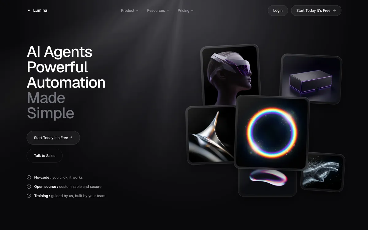
Тёмный экран со световыми лучами, крупный заголовок и кластер из шести наклонных стеклянных карточек с 3D-картинками.
Промпт
Recreate the website "Lumina" with high visual fidelity as a Tailwind CSS and Vanilla JavaScript site.

The result must match the supplied reference website exactly, including its specific dark-themed aesthetic, glassmorphism effects, and scroll-driven entrance animations.

Preserve source quirks:
- The horizontal scrollbars on the dashboard sidebar are explicitly hidden via a `.no-scrollbar` style.
- Several elements use hardcoded `[animation:...]` classes for staggered entry.
- Some SVG icons (Solar library) are rotated 90 degrees manually via classes (e.g., the logo icon).

CRITICAL FIDELITY CONSTRAINTS
- Background: Do not use a simple solid color. Must use the exact stacking of `aura-background-component` with the Unicorn Studio script and the complex fixed positioning glow effects (gradient lines and blur circles).
- Scroll Animation: Implementation of the `IntersectionObserver` logic for `animate-on-scroll` is mandatory. Elements start at `opacity: 0` and `translateY(30px)`.
- Glassmorphism: Use the exact `.glass-card` CSS definition (3% white bg, 20px blur, specific 1px border, and multi-layered box shadow).
- Typography: Exact font pairing is mandatory: Geist for headings, Inter for body text.

TECH STACK / DEPENDENCIES
- Tailwind CSS (CDN)
- Iconify-Icon (solar: icon set)
- Lucide Icons (script tag version)
- Google Fonts (Inter, Geist)
- UnicornStudio.js (v1.4.29 for background effects)

GLOBAL STYLE
- Body: `bg-[#09090b]`, `text-white`, `selection:bg-white/10`.
- Custom Styles: Include the `@keyframes animationIn`, `lumina-float`, `lumina-pulse`, `lumina-scan`, `lumina-shine`, `lumina-highlight`, `lumina-scale`, `lumina-blink`, and `lumina-load` exactly as defined in the source.

ASSET MAP
- Hero Image 1: https://hoirqrkdgbmvpwutwuwj.supabase.co/storage/v1/object/public/assets/assets/5b2b94ae-4a0b-458d-b838-58b0fb5fadfd_800w.webp
- Hero Image 2: https://hoirqrkdgbmvpwutwuwj.supabase.co/storage/v1/object/public/assets/assets/98ceb9e8-e614-438f-b0b6-6ea9a4cd962a_800w.jpg
- Hero Image 3: https://hoirqrkdgbmvpwutwuwj.supabase.co/storage/v1/object/public/assets/assets/cce9b24e-35c2-4401-966f-6862ca3cbe67_320w.webp
- Hero Image 4: https://hoirqrkdgbmvpwutwuwj.supabase.co/storage/v1/object/public/assets/assets/84c1c812-11be-4bbf-980f-9c90b7a0d779_800w.webp
- Hero Image 5: https://hoirqrkdgbmvpwutwuwj.supabase.co/storage/v1/object/public/assets/assets/7f606005-ba8e-4906-8403-5200e9723d9f_800w.webp
- Hero Image 6: https://hoirqrkdgbmvpwutwuwj.supabase.co/storage/v1/object/public/assets/assets/6d1c6740-1f50-4f43-bbb0-8bfb2f9620bd_320w.webp
- Testimonial Image 1: https://hoirqrkdgbmvpwutwuwj.supabase.co/storage/v1/object/public/assets/assets/91a69d34-7bfd-4a15-802d-67ddeff8c160_800w.webp
- Testimonial Image 2: https://hoirqrkdgbmvpwutwuwj.supabase.co/storage/v1/object/public/assets/assets/e2b6bfe8-29b7-48cb-9aa6-a44e21613618_800w.webp

LAYER STACK / POSITIONING MAP
- BACKGROUND LAYER (z: -10): Fixed `aura-background-component` with Unicorn Studio script.
- GLOW LAYER (z: 0): Fixed container with absolute children: center vertical line (`bg-gradient-to-b via-zinc-500/5`), top blur circle, and massive overlapping elliptical borders (`150vw` and `120vw`).
- NAV LAYER (z: 50): Fixed header with `backdrop-blur-sm` buttons.
- MAIN CONTENT (z: 20): Relative containers for all sections.
- HERO IMAGE CLUSTER (z: 50/60+): Stack of absolute `.glass-card` elements with varying `rotate` values (-4deg to 4deg) and `hover:scale-105` transforms.

SECTION 1 - HERO
- Two-column grid. Left: `h1` with editorial tracking, and nested button group. Buttons use a "Double Text" animation: on hover, the original text slides down and a hidden absolute clone slides in from the top.
- Right: Staggered cluster of 6 floating images, each wrapped in a `.glass-card` with `glass-highlight` overlay.

SECTION 2 - ENTERPRISE FEATURES
- 3-column grid of `bg-[#0e0e11]` cards. Each card contains a "Graphic Area" (h-64) and a text area.
- Internal Graphics must use specific animations: `lumina-float` for the parent containers and `lumina-scan`/`lumina-pulse`/`lumina-shine` for inner SVG/UI elements.
- Feature 5 (Workspace Switcher) requires a nested relative "Dropdown Menu" visual (not functional, but visually perfect).
- Feature 6 (On-Premise) requires a terminal UI with a working `lumina-load` progress bar animation.

SECTION 3 - DASHBOARD PREVIEW
- Complex mockup of a financial app. Dark sidebar with vertical icons. Main content includes: Quick Action buttons with inner shadows, Stat cards with SVG icons, and a Transaction Table.
- Activity Graph: Must be a pure CSS Bar Chart using a flex container and `bg-gradient-to-t` bars with varying heights.

SECTION 4 - PRICING & INTEGRATIONS
- Pricing: 3-card layout. Pro plan is elevated via `md:-translate-y-4` and an extra `white/5` gradient overlay.
- Comparison Table: `overflow-x-auto` table with `divide-white/5` borders and specific `uppercase tracking-wider` subheaders.
- Integrations: 8-item grid using `iconify-icon` (Logos/Simple-Icons) inside rounded cards.

SECTION 5 - TESTIMONIALS & CTA
- Testimonial: Large editorial layout. Left side features a huge "40" masked with a vertical linear gradient. Right side features two portrait images in `rounded-3xl` frames.
- Final CTA: Centered layout inside a `bg-gradient-to-b from-[#131316] to-[#0e0e11]` card with a large radial gradient light effect.

GLOBAL ANIMATION / INTERACTION RULES
- All sections must include the `animate-on-scroll` class.
- Buttons use specific cubic-bezier transition: `ease-[cubic-bezier(0.15,0.83,0.66,1)]` with a duration of `1000ms`.
- Hovering over `.glass-card` elements must increase `z-index` to 100 to ensure they overlap neighbors.

IMPLEMENTATION REQUIREMENTS
- Use exact original URLs from the ASSET MAP.
- Preserve exact layer order and stacking contexts.
- Final page must be indistinguishable from the provided source in layout, motion, and style.
Промпт на английском — ИИ-инструменты понимают его лучше
Лендинг платформы ИИ-агентов. Слева крупный заголовок «AI Agents Powerful Automation Made Simple» (последние слова приглушены) и две кнопки с эффектом «двойного текста»: при наведении надпись уезжает вниз, а сверху въезжает копия. Справа кластер из шести стеклянных карточек с 3D-рендерами под разными углами, при наведении карточка выходит на передний план. Ниже сетка корпоративных функций с анимированными графиками, макет финансового дашборда, тарифы, интеграции, отзыв с огромной «40» и финальный призыв. Подойдёт SaaS и ИИ-продуктам.
Как получить такой же результат
Запускайте промпт в Claude. Восемь картинок (шесть для кластера, две для отзыва) даны прямыми ссылками, все рабочие. Какая картинка в какой карточке, промпт не говорит: мы расставили по порядку.
Фон промпт называет «Unicorn Studio», но ID проекта не даёт, поэтому оригинальных световых лучей сам по себе не получить. Мы нарисовали их через CSS: conic-gradient с маской и размытые круги. Хотите точь-в-точь, соберите сцену на unicorn.studio и вставьте её ID в data-us-project.
Тексты секций (функции, тарифы, строки дашборда) в промпте не заданы, Claude придумывает их сам. Начните с первого экрана, остальное дорабатывайте отдельными запросами.
Lucide с unpkg.com/lucide@latest часто отдаёт 404; берите cdn.jsdelivr.net/npm/lucide@0.469.0. Иконки Solar идут через iconify-icon.
Появление блоков при прокрутке сделано через IntersectionObserver и класс animate-on-scroll: элемент стартует с opacity: 0 и сдвигом на 30 пикселей.