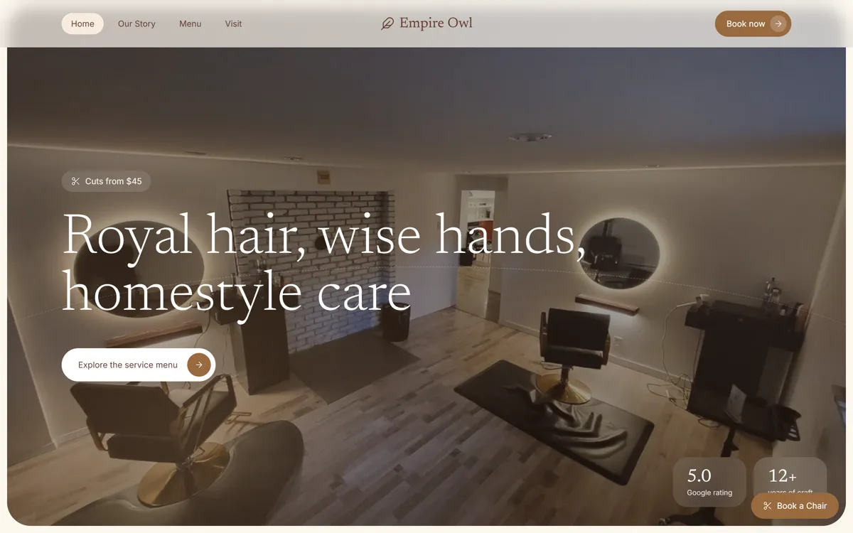
Уютный сайт парикмахерской: тёмное фото салона со скруглением, засечный заголовок, кремовые карточки услуг и тёплый коричневый.
Промпт
Recreate the website "Empire Owl Salon" with high visual fidelity as a Tailwind CSS and Lucide Icon-based site.

The result must match the supplied reference website exactly, preserving its sophisticated, warm, and "homestyle" aesthetic.

Preserve source quirks:
- The site uses a mix of "Empire Owl Salon" (Center Nav) and "Dermato" (Title tag); use "Empire Owl Salon" as the primary identity.
- Inconsistent font usage: The logo and headings use serif styles (Newsreader/Hedvig), while sub-labels and buttons use sans-serif (Inter).
- Layout uses a dashed arch graphic overlay in the hero section that is decorative but technically a border-t on a large absolute div.

CRITICAL FIDELITY CONSTRAINTS
- Use the specific oklch color palette defined in the @theme block.
- The Hero section background image must use `mix-blend-screen` and an opacity of 55% against the dark background (#1b120d).
- All image hover states must utilize `group-hover:scale-105` with a 700ms duration transition.
- Do not substitute Lucide icons; use the exact library and 1.5 stroke-width.

TECH STACK / DEPENDENCIES
- Tailwind CSS (v4 compatible or CDN version)
- Lucide Icons (CDN: https://unpkg.com/lucide@latest)
- Google Fonts: 'Newsreader' (Serif), 'Hedvig Letters Serif', and 'Inter' (Sans)

GLOBAL STYLE
- Background: oklch(98% 0.015 75) (#fdf7ef)
- Foreground: oklch(25% 0.03 50) (#633b2c)
- Primary: oklch(55% 0.1 50) (#986a3e)
- Secondary/Muted: oklch(95% 0.02 75) (#f7ecdf)
- Base Font: Inter (Sans-serif)
- Heading Font: Newsreader (Serif, light weight)

ASSET MAP
- Hero BG: https://hoirqrkdgbmvpwutwuwj.supabase.co/storage/v1/object/public/assets/assets/c62b5438-f75e-4904-bfd1-674ae5303d47_3840w.webp
- Circular Inset 1: https://images.unsplash.com/photo-1519699047748-de8e457a634e?auto=format&fit=crop&q=80&w=120
- Circular Inset 2: https://images.unsplash.com/photo-1521590832167-7bcbfaa6381f?auto=format&fit=crop&q=80&w=120
- Image Grid 1: https://images.unsplash.com/photo-1562322140-8baeececf3df?auto=format&fit=crop&q=80&w=700
- Image Grid 2: https://images.unsplash.com/photo-1595476108010-b4d1f102b1b1?auto=format&fit=crop&q=80&w=700
- Image Grid 3: https://images.unsplash.com/photo-1580618672591-eb180b1a973f?auto=format&fit=crop&q=80&w=1100
- Image Grid 4: https://images.unsplash.com/photo-1522337660859-02fbefca4702?auto=format&fit=crop&q=80&w=800
- Image Grid 5: https://images.unsplash.com/photo-1487412947147-5cebf100ffc2?auto=format&fit=crop&q=80&w=700
- Team Section: https://images.unsplash.com/photo-1560869713-7d0a29430803?auto=format&fit=crop&q=80&w=1000
- Before/After Split: https://hoirqrkdgbmvpwutwuwj.supabase.co/storage/v1/object/public/assets/assets/917d6f93-fb36-439a-8c48-884b67b35381_1600w.jpg (Left) and https://images.unsplash.com/photo-1595476108010-b4d1f102b1b1?auto=format&fit=crop&q=80&w=800 (Right)

VECTOR / ICON SHAPES
- Use `data-lucide="feather"` for logo branding.
- Use `data-lucide="arrow-right"` for buttons.
- Custom SVG path for Color Menu (Section 4): `M12 2v20 M17 5H9.5a3.5 3.5 0 0 0 0 7h5a3.5 3.5 0 0 1 0 7H6`.

LAYER STACK / POSITIONING MAP
- Navigation: `fixed top-0`, z-index 50, `backdrop-blur-md`.
- Hero Container: `relative rounded-[2.5rem]`, `bg-[#1b120d]`.
- Hero Overlays:
  1. BG Image: `absolute inset-0`, opacity 55%, mix-blend-screen.
  2. Arch: `absolute bottom-0 w-[120%] h-1/2 left-[-10%]`, `border-t`, `rounded-t-[100%]`, `border-dashed`.
  3. Gradient: `absolute inset-0` with radial-gradients for light/warm spots.
  4. Stats Badges: `absolute bottom-8 right-8` (hidden on mobile).
- Service Grid: `grid-cols-1 md:grid-cols-12` spanning 3, 6, and 3 columns respectively.

SECTION 1 - NAVIGATION
- Three-part flex: [Links (Left)] [Logo + Feather Icon (Center)] [CTA Button (Right)].
- Links: Home (pill background), Our Story, Menu, Visit.
- Mobile: Menu icon visible, other links hidden.

SECTION 2 - HERO
- Text: "Royal hair, wise hands, homestyle care".
- Button: "Explore the service menu" with white circular arrow icon.
- Left Badge: White/12 background, blur-xl, contains `scissors` icon and pricing label.

SECTION 3 - INTRO
- Center-aligned text with two inline circular images representing "Glossy styled hair" and "Salon chair".
- Badge: "Independent Langford Salon" with a primary-colored dot.

SECTION 4 - SERVICE MENU (ACCORDION & CARDS)
- Accordion: One item expanded by default (Layered cuts). Plus/Minus icons for toggles.
- Cards: Three-column grid (Haircuts, Color, Beauty). "Color" card is high-contrast Primary background with white text and a decorative `absolute` circle in the top-right.

SECTION 5 - TEAM / BENTO GRID
- Left (5 cols): Full height image with translucent internal card at the bottom showing team names and "5.0 Rated" stats.
- Right (7 cols): Text content + 3-column micro-grid for brand pillars + 4-column micro-grid for operating hours.

SECTION 6 - BEFORE/AFTER
- Split-view image with a centered `white` divider line and a `chevrons-left-right` icon handle in the middle.
- Translucent dark card at the bottom (`bg-black/45 backdrop-blur-xl`) for "Transformation focused" copy.

SECTION 7 - TESTIMONIALS
- 3-column grid. Middle card uses Primary background with white text. Others are white with thin black/5 borders.

SECTION 8 - STYLE GUIDES (BLOG)
- 1 Large featured post (Left) and 3 stacked horizontal posts (Right).
- Hover effect: Image scales up slightly inside container.

SECTION 9 - FOOTER & STICKY
- Footer: 12-column grid. Left block for logo/socials, middle/right blocks for site links.
- Sticky Action: `fixed bottom-6 right-6`, bg-primary, shadow-lg, `scissors` icon, labeled "Book a Chair".

GLOBAL ANIMATION / INTERACTION RULES
- All buttons and links: `transition-colors` or `transition-all`.
- Hover icons: `group-hover:translate-x-0.5` for arrow icons.
- Lucide Stroke: 1.5 constant.

COMMON MISTAKES TO AVOID
- Do not use standard rounded corners; use `rounded-[2rem]` or `rounded-[2.5rem]` for main blocks.
- Do not omit the `backdrop-blur-xl` on cards sitting over images.
- Do not use generic browns; use the specific OKLCH definitions provided.

IMPLEMENTATION REQUIREMENTS
- Use exact asset URLs.
- Use the Newsreader font for headings and serif weights.
- Final result must be a single-page responsive landing page.
Промпт на английском — ИИ-инструменты понимают его лучше
Лендинг независимого салона. Крупный блок с большим скруглением, внутри затемнённое фото интерьера, которое «просвечивает» через mix-blend-screen, пунктирная дуга и стеклянные бейджи «Cuts from…» и «5.0 Rated». Дальше: центрированный абзац с двумя круглыми фото прямо в тексте, аккордеон услуг, карточка «Color» на коричневом фоне, командный бенто-блок, сравнение «до и после», отзывы, блог и плавающая кнопка «Book a Chair». Подойдёт салонам, барбершопам, студиям маникюра и бровистам.
Как получить такой же результат
Запускайте в Claude, просите один index.html с Tailwind по CDN. Картинки в промпте даны полными ссылками, но две из них (фон героя и «до») лежат на хранилище Aura и могут не открыться, если ссылку закроют: тогда сгенерируйте своё фото салона.
Палитра в промпте задана через oklch и в блоке @theme Tailwind v4. Для CDN-версии проще положить цвета в tailwind.config: у нас это #fdf7ef (фон), #633b2c (текст), #986a3e (акцент), #f7ecdf (карточки).
Промпт не говорит, как выровнен заголовок героя. У нас он стоит слева внизу, а на сайте Aura по центру: если нужна центровка, допишите «выровняй текст героя по центру».
Иконки Lucide берите с cdn.jsdelivr.net/npm/lucide@0.469.0/dist/umd/lucide.min.js (адрес с unpkg иногда не отвечает) и после загрузки вызывайте lucide.createIcons() с толщиной линии 1.5.
Названия услуг, цены, имена мастеров и отзывы Claude придумает сам: замените их своими, а в промпте поменяйте «Empire Owl Salon» и город.